Table of Contents
In the field of web development, a website’s aesthetic appeal is essential for engaging users and improving their experience. CSS animation is an effective tools for developer. CSS animation allows developers to breathe life into static web elements, resulting in visually appealing and dynamic user interfaces that capture and delight visitors.
Understanding CSS Animation
CSS animation enables developers to animate HTML elements without requiring JavaScript or any other tools. Keyframes, transitions, and other CSS attributes allow developers to control many aspects of an element’s appearance and behaviour over time.
Key Concepts
1. keyframes
A keyframe in CSS defines the styles that an element should have at certain moments during an animation sequence. Consider establishing waypoints along a path that an element will follow as it animates. These waypoints, given as percentages ranging from 0% to 100%, specify how the element should appear at each stage of the animation.
Syntax and Usage
To define keyframes in CSS, use the @keyframes rule followed by a name for the animation sequence. Within the @keyframes block, you specify the percentage values (or keywords like from and to), as well as the CSS attributes and values that should be applied at certain points.
Here’s a basic example
@keyframes slide-in {
  from {
    transform: translateX(-100%);
  }
  to {
    transform: translateX(0);
  }
}
In this example, the slide-in animation slides an element from left to right, starting from outside the viewport (-100% of its width) and ending at its original position (0%).
Applying Keyframes
Once you’ve set your keyframes, use CSS’s animation property to apply them to elemets. This property lets you provide the animation’s name, duration, timing function, delay, and other characteristics.
.element {
  animation: slide-in 1s ease-out;
}
The slide-in animation is assigned to the.element class, which lasts for one second and uses an easing function for smooth acceleration and deceleration..
Let’s see an example
This animation displays a car moving from one side of the screen to the other.
Output of this Program

<!DOCTYPE html>
<html>
<head>
    <meta charset='utf-8'>
    <meta http-equiv='X-UA-Compatible' content='IE=edge'>
    <title>Page Title</title>
    <meta name='viewport' content='width=device-width, initial-scale=1'>
    <link rel='stylesheet' type='text/css' media='screen' href='main.css'>
    <script src='main.js'></script>

    <style>
      html, body {
        overflow-x: hidden;
      }
.car {
  width: 100px;
  height: 50px;
  transform: scale(5);
  /* background-color: #2ecc71; */
  position: absolute;
  top: 50%;
  left: 0;
  animation: moveCar 7s linear infinite;
}

@keyframes moveCar {
  0% { left: -20%; }
  100% { left: 115%; }
}

</style>

<body>
    <div class="car">
      <!-- start  -->
      <svg version="1.1" xmlns="http://www.w3.org/2000/svg" xmlns:xlink="http://www.w3.org/1999/xlink" x="0px" y="0px"
      viewBox="0 0 750 500" style="enable-background:new 0 0 750 500;" xml:space="preserve">
   <style type="text/css">
     .st0{fill:#141414;}
     .st1{fill:#DE972C;}
     .st2{fill:#F2A636;}
     .st3{fill:#A36C20;}
     .st4{fill:#DE9E3E;}
     .st5{fill:#EBEBEB;}
     .st6{fill:none;stroke:#141414;stroke-width:0.9628;stroke-miterlimit:10;}
     .st7{fill:none;stroke:#141414;stroke-width:0.9628;stroke-linecap:round;stroke-linejoin:round;stroke-miterlimit:10;}
     .st8{fill:#161E30;}
     .st9{clip-path:url(#SVGID_00000018231064182222124870000000035645115232817803_);}
     .st10{fill:#1F1F1F;}
     .st11{fill:#3D3D3D;}
     .st12{fill:#7A7A7A;}
     .st13{fill:#474747;}
     .st14{fill:#333333;}
     .st15{fill:#BFBFBF;}
     .st16{fill:#525252;}
     .st17{fill:none;stroke:#2B2B2B;stroke-width:0.4814;stroke-miterlimit:10;}
     .st18{fill:#161E30;stroke:#EBEBEB;stroke-width:0.9628;stroke-linecap:round;stroke-linejoin:round;stroke-miterlimit:10;}
     .st19{fill:#C14833;}
     .st20{opacity:0.5;clip-path:url(#SVGID_00000091706722737080842210000006458308634696565148_);}
     .st21{opacity:0.12;fill:#FFFFFF;}
     .st22{opacity:0.5;clip-path:url(#SVGID_00000130632937548519076720000013890405084132807296_);}
     .st23{opacity:0.5;clip-path:url(#SVGID_00000008106520281409849310000002899769641970898100_);}
     .st24{fill:#B37823;}
     .st25{fill:#FFC34D;}
   </style>
   <g id="BACKGROUND">
   </g>
   <g id="OBJECTS">
     <g>
       <g>
         <path class="st0" d="M148.38,287.48v13.41l1.76,1.2c4.98,3.39,10.87,5.21,16.9,5.21h56.36l26,7.76h57.5c4.5,0,8.81-1.79,12-4.97
           l0,0h28.25h0c4.12,4.12,9.7,6.43,15.53,6.43h94.04c3.5,0,6.85-1.39,9.33-3.86l0,0h28.95l0,0c3.95,3.95,9.31,6.17,14.89,6.17
           h82.72l9.32-9.32h47.82c4.47,0,8.76-1.78,11.92-4.94l0,0v-17.09H148.38z"/>
       </g>
       <path class="st1" d="M599.08,210.97h-35.19c-6.97,0-13.66,2.77-18.59,7.7l-6.68,6.68l54.29,6.32
         c-1.41-10.09,5.28-16.84,7.05-18.44c0.27-0.25,0.42-0.59,0.42-0.96C600.38,211.56,599.8,210.97,599.08,210.97z"/>
       <path class="st1" d="M106.06,217.67c-10.96-2.29-21.7-5.54-32.1-9.69H68.6l3.23,16.61c0.34,1.77,1.89,3.04,3.69,3.04h8.09
         l29.88-8.41L106.06,217.67z"/>
       <path class="st2" d="M685.7,249.57l-4.15,20.75l9.59,3.24l-20.63,31.07h-12.91c-1.24,0-2.38-0.73-2.87-1.88
         c-0.51-1.13-1.64-1.87-2.89-1.87H148.38l-5.91-3.68l-55.62-3.74l-11.96-7.35c-9.71-5.98-15.63-16.56-15.63-27.96v-8.57
         c0-3.26,0.87-6.39,2.46-9.1c0.06-0.11,0.13-0.21,0.2-0.32c0.74-1.23,1.64-2.38,2.69-3.41c1.11-1.12,2.4-2.1,3.81-2.91
         c2.05-1.17,4.13-2.27,6.23-3.33c15.46-7.8,32.23-12.72,49.49-14.51l27.91-2.91c7.67-0.8,15.22-2.33,22.55-4.57
         c7.1-2.17,14-5,20.61-8.47l24.46-12.84c18.43-9.66,38.44-16.03,59.1-18.59c70.61-8.76,129.13-1.15,142.16,0.82
         c1.77,0.27,3.44,0.94,4.87,1.99l2.89,2.1l57.55,41.94h4.16c4.22,0,8.38,0.98,12.16,2.86c0.81,0.39,1.69,0.63,2.58,0.68
         l130.36,6.83c8.72,0.47,17.37,1.67,25.85,3.6c8.49,1.93,16.8,4.58,24.87,7.95c1.11,0.46,2.09,1.12,2.91,1.95
         c0.68,0.68,1.23,1.46,1.65,2.32c0.55,1.1,0.88,2.33,0.92,3.62c0.01,0.12,0.01,0.22,0.01,0.34v3.94H685.7z"/>
       <g>
         <path class="st3" d="M691.7,245.3c-26-5.37-52.59-8.07-79.15-8.07H304.71c-18.69,0-37.5-1.71-55.89-5.06l-3.19-0.57
           c-27.19-4.95-54.94-6.22-82.48-3.72l-98.52,8.88c1.11-1.12,2.4-2.1,3.81-2.91c2.05-1.17,4.13-2.27,6.23-3.33l88.01-7.92
           c28.01-2.54,56.23-1.25,83.9,3.79l3.19,0.58c18.08,3.29,36.57,4.96,54.94,4.96h307.84c25.67,0,51.37,2.49,76.57,7.44
           c0.68,0.68,1.23,1.46,1.65,2.32C691.33,242.79,691.66,244.02,691.7,245.3z"/>
       </g>
       <path class="st1" d="M691.14,273.56l-20.63,31.07h-12.91c-1.24,0-2.38-0.73-2.87-1.88c-0.51-1.13-1.64-1.87-2.89-1.87H148.38
         l-5.91-3.68l-55.62-3.74l-11.96-7.35c-9.71-5.98-15.63-16.56-15.63-27.96v-8.57H685.7l-4.15,20.75L691.14,273.56z"/>
       <polygon class="st4" points="126.06,249.57 114.03,261.6 228.34,261.6 240.65,249.57 		"/>
       <polygon class="st4" points="500.6,249.57 488.57,261.6 602.87,261.6 615.19,249.57 		"/>
       <path class="st5" d="M64.92,244.29h-6.39c-2.23,0-4.04,1.81-4.04,4.04v19.13c0,3.39,1.44,6.61,3.96,8.88l16.33,14.65
         c1.48,1.33,3.4,2.07,5.39,2.07l6.68,0.4l-14.74-18.17c-2.58-3.11-3.99-7.01-4-11.05l-0.03-16.78
         C68.08,245.71,66.67,244.29,64.92,244.29z"/>
       <path class="st6" d="M322.11,217.8l-4.46,11.74c-1.04,3.33-1.57,6.81-1.57,10.3v47.78c0,2.21,1.79,4,4,4h179.64"/>
       <path class="st7" d="M490.41,215.49l7.66,12.89c1.11,1.87,1.75,3.98,1.86,6.15l1.88,36.26c0.08,1.59,0.04,3.19-0.13,4.78
         l-2.87,27.29"/>
       <g>
         <path class="st8" d="M687.76,249.57c-0.69,0-1.37,0-2.04,0l-4.73,23.66C695.52,268.78,692.47,253.48,687.76,249.57z"/>
       </g>
       <path class="st5" d="M679.6,270.32h9.73c3.85,0,6.76,3.48,6.09,7.27l-0.72,4.06c-0.45,2.51-1.74,4.79-3.67,6.45l-4.01,3.46
         c-1.27,1.09-2.3,2.43-3.04,3.93l-2.54,5.14c-1.21,2.45-3.71,4-6.44,4h-13.28l14.06-22.7l0.41-8.37
         C676.28,271.75,677.78,270.32,679.6,270.32z"/>
       <g>
         <defs>
           <path id="SVGID_1_" d="M59.31,248.47c-0.02,0.37-0.04,0.74-0.04,1.11v8.57c0,11.4,5.91,21.98,15.62,27.96l11.96,7.36l55.62,3.74
             l5.91,3.68h503.45c1.25,0,2.38,0.73,2.88,1.87l0,0c0.51,1.14,1.64,1.87,2.88,1.87h12.91l21.21-31.93v-24.23H59.31z"/>
         </defs>
         <clipPath id="SVGID_00000106864297801426720200000012039995041299575681_">
           <use xlink:href="#SVGID_1_"  style="overflow:visible;"/>
         </clipPath>
         <g style="clip-path:url(#SVGID_00000106864297801426720200000012039995041299575681_);">
           <path class="st0" d="M149.34,301.19l17.95-25.53c9.65-13.73,25.44-22.03,42.22-22.21l22.47-0.24
             c19.67,0,35.56,15.41,36.16,35.08l0.67,21.78l-119.47,9.2V301.19z"/>
           <path class="st5" d="M231.98,254.18c9.2,0,17.9,3.53,24.51,9.93c6.61,6.41,10.41,15.01,10.69,24.21l0.64,20.86l-117.52,9.05
             v-16.74l17.77-25.28c9.48-13.48,24.97-21.63,41.44-21.8l22.08-0.23L231.98,254.18 M231.98,252.25c-0.13,0-0.27,0-0.4,0
             l-22.08,0.23c-17.14,0.18-33.14,8.6-43,22.62l-18.12,25.77v19.43l121.43-9.35l-0.7-22.7
             C268.49,268.18,252.03,252.25,231.98,252.25L231.98,252.25z"/>
         </g>
         <g style="clip-path:url(#SVGID_00000106864297801426720200000012039995041299575681_);">
           <path class="st0" d="M507.71,301.18l17.51-25.53c9.41-13.72,24.79-22.02,41.15-22.2l21.92-0.24c19.17,0,34.65,15.41,35.24,35.08
             l0.65,21.78l-116.46,9.2V301.18z"/>
           <path class="st5" d="M588.28,254.18c8.95,0,17.42,3.52,23.85,9.91c6.45,6.41,10.15,15.01,10.43,24.23l0.62,20.87l-114.51,9.05
             v-16.75l17.34-25.28c9.23-13.47,24.32-21.61,40.36-21.78l21.53-0.23L588.28,254.18 M588.28,252.25c-0.13,0-0.26,0-0.39,0
             l-21.53,0.23c-16.71,0.18-32.32,8.6-41.93,22.62l-17.67,25.77v19.43l118.41-9.35l-0.68-22.7
             C623.89,268.18,607.83,252.25,588.28,252.25L588.28,252.25z"/>
         </g>
       </g>
       <g>
         <polygon class="st0" points="508.85,301.52 622.76,302.03 622.74,300.77 509.36,300.83 			"/>
       </g>
       <polygon class="st0" points="150.97,300.89 221.5,296.29 267.37,300.89 217.47,302.68 		"/>
       <g>
         <g>

             <ellipse transform="matrix(0.9278 -0.373 0.373 0.9278 -96.4531 102.0006)" class="st10" cx="215.34" cy="300.23" rx="42.14" ry="42.14"/>
         </g>

           <ellipse transform="matrix(0.7071 -0.7071 0.7071 0.7071 -149.2244 240.2041)" class="st11" cx="215.34" cy="300.23" rx="22.78" ry="22.78"/>
         <g>
           <circle class="st12" cx="215.34" cy="300.23" r="13.07"/>
           <g>
             <circle class="st13" cx="222.2" cy="293.45" r="1.82"/>
             <path class="st13" d="M206.65,293.45c0,1.01,0.82,1.82,1.82,1.82c1.01,0,1.82-0.82,1.82-1.82c0-1.01-0.82-1.82-1.82-1.82
               C207.47,291.62,206.65,292.44,206.65,293.45z"/>
             <path class="st13" d="M220.38,307.32c0,1.01,0.82,1.82,1.82,1.82c1.01,0,1.82-0.82,1.82-1.82c0-1.01-0.82-1.82-1.82-1.82
               C221.2,305.5,220.38,306.31,220.38,307.32z"/>
             <path class="st13" d="M206.65,307.32c0,1.01,0.82,1.82,1.82,1.82c1.01,0,1.82-0.82,1.82-1.82c0-1.01-0.82-1.82-1.82-1.82
               C207.47,305.5,206.65,306.31,206.65,307.32z"/>
           </g>
         </g>
         <polygon class="st12" points="209.07,321.74 211.42,304.15 193.83,306.5 193.83,293.96 211.42,296.31 209.07,278.72
           221.61,278.72 219.26,296.31 236.85,293.96 236.85,306.5 219.26,304.15 221.61,321.74 			"/>
         <g>
           <path class="st14" d="M215.34,277.45c12.58,0,22.78,10.2,22.78,22.78c0,12.58-10.2,22.78-22.78,22.78
             c-12.58,0-22.78-10.2-22.78-22.78C192.56,287.65,202.76,277.45,215.34,277.45 M215.34,273.6c-14.68,0-26.63,11.95-26.63,26.63
             c0,14.68,11.95,26.63,26.63,26.63c14.68,0,26.63-11.95,26.63-26.63C241.97,285.55,230.02,273.6,215.34,273.6L215.34,273.6z"/>
         </g>
         <g>
           <path class="st15" d="M215.34,280.34c10.97,0,19.89,8.92,19.89,19.89c0,10.97-8.92,19.89-19.89,19.89
             c-10.97,0-19.89-8.92-19.89-19.89C195.45,289.26,204.37,280.34,215.34,280.34 M215.34,277.45c-12.58,0-22.78,10.2-22.78,22.78
             c0,12.58,10.2,22.78,22.78,22.78c12.58,0,22.78-10.2,22.78-22.78C238.12,287.65,227.92,277.45,215.34,277.45L215.34,277.45z"/>
         </g>
         <g>
           <polygon class="st15" points="217.78,300.23 212.9,300.23 210.07,279.07 220.61,279.07 				"/>
         </g>
         <g>
           <polygon class="st15" points="215.34,302.67 215.34,297.79 236.5,294.97 236.5,305.5 				"/>
         </g>
         <g>
           <polygon class="st15" points="212.9,300.23 217.78,300.23 220.61,321.39 210.07,321.39 				"/>
         </g>
         <g>
           <polygon class="st15" points="215.34,297.79 215.34,302.67 194.18,305.5 194.18,294.97 				"/>
         </g>
         <path class="st16" d="M212.44,300.23c0,1.6,1.3,2.9,2.9,2.9c1.6,0,2.9-1.3,2.9-2.9c0-1.6-1.3-2.9-2.9-2.9
           C213.74,297.33,212.44,298.63,212.44,300.23z"/>

           <ellipse transform="matrix(0.7071 -0.7071 0.7071 0.7071 -149.2244 240.2041)" class="st17" cx="215.34" cy="300.23" rx="22.78" ry="22.78"/>
       </g>
       <g>
         <g>

             <ellipse transform="matrix(0.9874 -0.1581 0.1581 0.9874 -40.2761 94.1876)" class="st10" cx="571.84" cy="300.23" rx="42.14" ry="42.14"/>
         </g>

           <ellipse transform="matrix(0.9821 -0.1883 0.1883 0.9821 -46.3102 113.0668)" class="st11" cx="571.84" cy="300.23" rx="22.78" ry="22.78"/>
         <g>
           <circle class="st12" cx="571.84" cy="300.23" r="13.07"/>
           <g>
             <path class="st13" d="M576.88,293.45c0,1.01,0.82,1.82,1.82,1.82c1.01,0,1.82-0.82,1.82-1.82c0-1.01-0.82-1.82-1.82-1.82
               C577.69,291.62,576.88,292.44,576.88,293.45z"/>
             <path class="st13" d="M563.15,293.45c0,1.01,0.82,1.82,1.82,1.82c1.01,0,1.82-0.82,1.82-1.82c0-1.01-0.82-1.82-1.82-1.82
               C563.96,291.62,563.15,292.44,563.15,293.45z"/>
             <path class="st13" d="M576.88,307.32c0,1.01,0.82,1.82,1.82,1.82c1.01,0,1.82-0.82,1.82-1.82c0-1.01-0.82-1.82-1.82-1.82
               C577.69,305.5,576.88,306.31,576.88,307.32z"/>
             <path class="st13" d="M563.15,307.32c0,1.01,0.82,1.82,1.82,1.82c1.01,0,1.82-0.82,1.82-1.82c0-1.01-0.82-1.82-1.82-1.82
               C563.96,305.5,563.15,306.31,563.15,307.32z"/>
           </g>
         </g>
         <polygon class="st12" points="565.57,321.74 567.92,304.15 550.33,306.5 550.33,293.96 567.92,296.31 565.57,278.72
           578.11,278.72 575.76,296.31 593.34,293.96 593.34,306.5 575.76,304.15 578.11,321.74 			"/>
         <g>
           <path class="st14" d="M571.84,277.45c12.58,0,22.78,10.2,22.78,22.78c0,12.58-10.2,22.78-22.78,22.78s-22.78-10.2-22.78-22.78
             C549.06,287.65,559.26,277.45,571.84,277.45 M571.84,273.6c-14.68,0-26.63,11.95-26.63,26.63c0,14.68,11.95,26.63,26.63,26.63
             c14.68,0,26.63-11.95,26.63-26.63C598.47,285.55,586.52,273.6,571.84,273.6L571.84,273.6z"/>
         </g>
         <g>
           <path class="st15" d="M571.84,280.34c10.97,0,19.89,8.92,19.89,19.89c0,10.97-8.92,19.89-19.89,19.89s-19.89-8.92-19.89-19.89
             C551.95,289.26,560.87,280.34,571.84,280.34 M571.84,277.45c-12.58,0-22.78,10.2-22.78,22.78c0,12.58,10.2,22.78,22.78,22.78
             s22.78-10.2,22.78-22.78C594.62,287.65,584.42,277.45,571.84,277.45L571.84,277.45z"/>
         </g>
         <g>
           <polygon class="st15" points="574.28,300.23 569.4,300.23 566.57,279.07 577.1,279.07 				"/>
         </g>
         <g>
           <polygon class="st15" points="571.84,302.67 571.84,297.79 592.99,294.97 592.99,305.5 				"/>
         </g>
         <g>
           <polygon class="st15" points="569.4,300.23 574.28,300.23 577.1,321.39 566.57,321.39 				"/>
         </g>
         <g>
           <polygon class="st15" points="571.84,297.79 571.84,302.67 550.68,305.5 550.68,294.97 				"/>
         </g>
         <circle class="st16" cx="571.84" cy="300.23" r="2.9"/>

           <ellipse transform="matrix(0.9821 -0.1883 0.1883 0.9821 -46.3102 113.0668)" class="st17" cx="571.84" cy="300.23" rx="22.78" ry="22.78"/>
       </g>
       <g>
         <path class="st5" d="M510.1,297.33L510.1,297.33L510.1,297.33z M510.1,297.33H268.58l0.92,3.56h237.26L510.1,297.33L510.1,297.33
           z"/>
       </g>
       <g>
         <path class="st8" d="M486.24,215.49l-18.37-0.36l-3.04-0.05c-0.04,0-0.07,0-0.12-0.01h-0.17c-0.72-0.01-1.41-0.31-1.92-0.81
           l-0.15-0.15c-0.02-0.01-0.04-0.03-0.06-0.05l-39.8-39.15c-0.51-0.5-0.16-1.36,0.55-1.36h4.95c0.38,0,0.75,0.12,1.06,0.35
           l0.98,0.71l54.57,39.77l1.49,1.08L486.24,215.49z"/>
         <g>
           <path class="st5" d="M484.72,214.38l-19.87-0.36c-0.64-0.02-1.24-0.27-1.7-0.72l-39.35-38.69h6.34l-0.98-0.71
             c-0.31-0.23-0.68-0.35-1.06-0.35h-5.43c-0.54,0-0.81,0.65-0.42,1.03l40.15,39.48c0.02,0.02,0.04,0.04,0.06,0.05
             c0.6,0.58,1.41,0.91,2.24,0.95c0.04,0.01,0.07,0.01,0.12,0.01l3.04,0.05l18.33,0.33L484.72,214.38z"/>
         </g>
       </g>
       <g>
         <path class="st8" d="M332.95,219c-0.21,0-0.39-0.16-0.41-0.37l-5.27-42.19c-0.01-0.12,0.02-0.23,0.1-0.32
           c0.08-0.09,0.18-0.14,0.3-0.15l43.09-1.94l44.97,0c0.11,0,0.21,0.04,0.29,0.12l45.82,44.14c0.19,0.18,0.12,0.4,0.1,0.46
           c-0.03,0.06-0.13,0.26-0.39,0.26H332.95z"/>
         <path class="st5" d="M415.69,174.51l45.69,44.01H333l-5.26-42.07l42.98-1.94H415.69 M415.71,173.55h-44.99l-43.09,1.94
           c-0.52,0.02-0.92,0.49-0.85,1.01l5.27,42.2c0.06,0.45,0.44,0.79,0.89,0.79h128.59c0.81,0,1.21-0.98,0.62-1.54l-45.82-44.14
           C416.17,173.64,415.94,173.55,415.71,173.55L415.71,173.55z"/>
       </g>
       <path class="st18" d="M329.61,219.13L329.61,219.13L329.61,219.13l-5.66-42.1c-0.05-0.35-0.38-0.59-0.72-0.52l-27.68,5.24
         c-13.74,2.6-25.12,12.19-30.01,25.3l0,0c-0.13,0.36,0.09,0.75,0.47,0.82L329.61,219.13z"/>
       <g>
         <path class="st2" d="M431.24,205.67c4,0,7.99,0.6,11.86,1.78l2.9,0.89c0.95,0.29,1.61,1.26,1.61,2.35c0,1.09-0.66,2.06-1.61,2.35
           l-2.82,0.87c-3.88,1.19-7.89,1.8-11.94,1.8c-0.39,0-0.71-0.35-0.71-0.79v-8.47C430.54,206.02,430.85,205.67,431.24,205.67z"/>
         <path class="st2" d="M447.28,218.12c-3.88-1.02-5.99-4.27-5.99-4.27l-6.25-1.45v3.19c0,1.1-0.89,2-2,2h-0.72
           c-1.43,0-2.58,1.16-2.58,2.58l0,0h19.1v0C448.83,219.22,448.2,218.37,447.28,218.12z"/>
         <path class="st1" d="M447.28,218.13c0.92,0.24,1.56,1.09,1.56,2.05l0,0h-1.38c-5.31-0.88-8.21-5.36-8.21-5.36l-4.21-0.98v-1.44
           l6.25,1.45C441.28,213.86,443.39,217.11,447.28,218.13z"/>
         <path class="st1" d="M447.59,210.83c-0.05,1.04-0.68,1.94-1.59,2.22l-2.82,0.87c-3.88,1.19-7.89,1.8-11.94,1.8
           c-0.39,0-0.71-0.35-0.71-0.79v-4.1H447.59z"/>
       </g>
       <g>
         <path class="st19" d="M80.3,272.85c-0.48,0-0.87-0.39-0.87-0.87v-6.21c0-0.48,0.39-0.87,0.87-0.87h12.21
           c0.48,0,0.87,0.39,0.87,0.87v6.21c0,0.48-0.39,0.87-0.87,0.87H80.3z"/>
         <path class="st5" d="M92.51,265.38c0.21,0,0.39,0.17,0.39,0.39v6.21c0,0.21-0.17,0.39-0.39,0.39H80.3
           c-0.21,0-0.39-0.17-0.39-0.39v-6.21c0-0.21,0.17-0.39,0.39-0.39H92.51 M92.51,264.42H80.3c-0.75,0-1.35,0.61-1.35,1.35v6.21
           c0,0.75,0.61,1.35,1.35,1.35h12.21c0.75,0,1.35-0.61,1.35-1.35v-6.21C93.86,265.02,93.25,264.42,92.51,264.42L92.51,264.42z"/>
       </g>
       <g>
         <path class="st19" d="M655.55,281.43c-0.48,0-0.87-0.39-0.87-0.87v-6.21c0-0.48,0.39-0.87,0.87-0.87h12.21
           c0.48,0,0.87,0.39,0.87,0.87v6.21c0,0.48-0.39,0.87-0.87,0.87H655.55z"/>
         <path class="st5" d="M667.75,273.96c0.21,0,0.39,0.17,0.39,0.39v6.21c0,0.21-0.17,0.39-0.39,0.39h-12.21
           c-0.21,0-0.39-0.17-0.39-0.39v-6.21c0-0.21,0.17-0.39,0.39-0.39H667.75 M667.75,273h-12.21c-0.75,0-1.35,0.61-1.35,1.35v6.21
           c0,0.75,0.61,1.35,1.35,1.35h12.21c0.75,0,1.35-0.61,1.35-1.35v-6.21C669.11,273.6,668.5,273,667.75,273L667.75,273z"/>
       </g>
       <g>
         <defs>
           <path id="SVGID_00000103229819773553502850000011892866079485140664_" d="M416.33,173.8c-0.17-0.16-0.39-0.25-0.62-0.25h-44.99
             l-43.09,1.94c-0.52,0.02-0.92,0.49-0.85,1.01l5.27,42.2c0.06,0.45,0.44,0.79,0.89,0.79h128.59c0.81,0,1.21-0.98,0.62-1.54
             L416.33,173.8z"/>
         </defs>
         <clipPath id="SVGID_00000005975171491660907550000014314236452229947016_">
           <use xlink:href="#SVGID_00000103229819773553502850000011892866079485140664_"  style="overflow:visible;"/>
         </clipPath>
         <g style="opacity:0.5;clip-path:url(#SVGID_00000005975171491660907550000014314236452229947016_);">

             <rect x="372.17" y="147.66" transform="matrix(0.7071 0.7071 -0.7071 0.7071 257.3773 -212.5006)" class="st21" width="26.06" height="113.54"/>

             <rect x="397.12" y="162.57" transform="matrix(0.7071 0.7071 -0.7071 0.7071 272.286 -218.676)" class="st21" width="5.97" height="113.54"/>

             <rect x="362.99" y="131.22" transform="matrix(0.7071 0.7071 -0.7071 0.7071 240.9402 -205.6922)" class="st21" width="11.54" height="113.54"/>
         </g>
       </g>
       <g>
         <defs>
           <path id="SVGID_00000153669026225344956180000006904346718619251640_" d="M329.61,219.13L329.61,219.13L329.61,219.13
             l-5.66-42.1c-0.05-0.35-0.38-0.59-0.72-0.52l-27.68,5.24c-13.74,2.6-25.12,12.19-30.01,25.3l0,0c-0.13,0.36,0.09,0.75,0.47,0.82
             L329.61,219.13z"/>
         </defs>
         <clipPath id="SVGID_00000172438025284241206370000001159051972043071901_">
           <use xlink:href="#SVGID_00000153669026225344956180000006904346718619251640_"  style="overflow:visible;"/>
         </clipPath>
         <g style="opacity:0.5;clip-path:url(#SVGID_00000172438025284241206370000001159051972043071901_);">

             <rect x="292.27" y="138.82" transform="matrix(0.7071 0.7071 -0.7071 0.7071 226.7508 -156.2312)" class="st21" width="19.39" height="113.54"/>

             <rect x="311.53" y="151.37" transform="matrix(0.7071 0.7071 -0.7071 0.7071 239.2999 -161.4295)" class="st21" width="5.97" height="113.54"/>
         </g>
       </g>
       <g>
         <defs>
           <path id="SVGID_00000072265536784952550830000014691597012804130469_" d="M486.24,215.49l-18.37-0.36l-3.04-0.05
             c-0.04,0-0.07,0-0.12-0.01h-0.17c-0.72-0.01-1.41-0.31-1.92-0.81l-0.15-0.15c-0.02-0.01-0.04-0.03-0.06-0.05l-39.8-39.15
             c-0.51-0.5-0.16-1.36,0.55-1.36h4.95c0.38,0,0.75,0.12,1.06,0.35l0.98,0.71l54.57,39.77l1.49,1.08L486.24,215.49z"/>
         </defs>
         <clipPath id="SVGID_00000011712069789870238730000001225033222895899814_">
           <use xlink:href="#SVGID_00000072265536784952550830000014691597012804130469_"  style="overflow:visible;"/>
         </clipPath>
         <g style="opacity:0.5;clip-path:url(#SVGID_00000011712069789870238730000001225033222895899814_);">

             <rect x="442.66" y="179.09" transform="matrix(0.7071 0.7071 -0.7071 0.7071 268.9125 -263.3608)" class="st21" width="19.39" height="27.66"/>

             <rect x="461.93" y="191.64" transform="matrix(0.7071 0.7071 -0.7071 0.7071 281.4613 -268.5587)" class="st21" width="5.97" height="27.66"/>

             <rect x="439.49" y="168.3" transform="matrix(0.7071 0.7071 -0.7071 0.7071 258.1156 -258.8886)" class="st21" width="4.15" height="27.66"/>
         </g>
       </g>
       <g>
         <path class="st24" d="M303.1,244.25c-2.68,0.39-5.36,0.64-8.04,0.84c-1.34,0.11-2.68,0.19-4.02,0.26
           c-1.34,0.07-2.68,0.15-4.02,0.18l1.25-1.06c-0.22,1.53-0.39,3.07-0.65,4.59l-0.72,4.58l-0.82,4.56c-0.26,1.52-0.6,3.03-0.89,4.55
           l-1.25-1.48c1.32,0.03,2.65,0.11,3.97,0.18c1.32,0.06,2.65,0.15,3.97,0.26c2.65,0.2,5.29,0.45,7.94,0.83
           c-2.65,0.39-5.29,0.64-7.94,0.83c-1.32,0.11-2.65,0.19-3.97,0.26c-1.32,0.07-2.65,0.15-3.97,0.18c-0.69,0.02-1.26-0.53-1.27-1.21
           c0-0.07,0-0.13,0.01-0.2l0.01-0.07c0.22-1.53,0.39-3.07,0.64-4.59l0.72-4.58l0.82-4.56c0.26-1.52,0.59-3.03,0.89-4.55l0.01-0.06
           c0.12-0.6,0.65-1.01,1.24-1c1.34,0.03,2.68,0.1,4.02,0.18c1.34,0.06,2.68,0.15,4.02,0.26
           C297.74,243.61,300.42,243.86,303.1,244.25z"/>
       </g>
       <g>
         <path class="st24" d="M299.09,268.57c-2.68,0.39-5.36,0.64-8.04,0.84c-1.34,0.11-2.68,0.19-4.02,0.26
           c-1.34,0.07-2.68,0.15-4.02,0.18l1.25-1.06c-0.22,1.53-0.39,3.07-0.65,4.59l-0.72,4.58l-0.82,4.56c-0.26,1.52-0.6,3.03-0.89,4.55
           l-1.25-1.48c1.32,0.03,2.65,0.11,3.97,0.18c1.32,0.06,2.65,0.15,3.97,0.26c2.65,0.2,5.29,0.45,7.94,0.83
           c-2.65,0.39-5.29,0.64-7.94,0.83c-1.32,0.11-2.65,0.19-3.97,0.26c-1.32,0.07-2.65,0.15-3.97,0.18c-0.69,0.02-1.26-0.53-1.27-1.21
           c0-0.07,0-0.13,0.01-0.2l0.01-0.07c0.22-1.53,0.39-3.07,0.64-4.59l0.72-4.58l0.82-4.56c0.26-1.52,0.59-3.03,0.89-4.55l0.01-0.06
           c0.12-0.6,0.65-1.01,1.24-1c1.34,0.03,2.68,0.1,4.02,0.18c1.34,0.06,2.68,0.15,4.02,0.26
           C293.73,267.93,296.41,268.18,299.09,268.57z"/>
       </g>
       <g>
         <path class="st25" d="M176.92,210.04c8.48-1.76,16.96-3.17,25.53-4.4c4.33-0.62,8.7-0.83,13.08-0.87c4.38,0,8.75,0.34,13.1,0.86
           c4.34,0.61,8.64,1.46,12.87,2.57c4.15,1.16,8.32,2.25,12.45,3.48c8.28,2.38,16.53,4.9,24.68,7.79c-8.55-1.33-17-3.04-25.42-4.87
           c-4.22-0.88-8.4-1.9-12.6-2.85c-4.12-0.97-8.29-1.77-12.49-2.29c-4.19-0.58-8.42-0.92-12.65-1.04
           c-4.24-0.17-8.48-0.05-12.72,0.21C194.19,209.28,185.56,209.87,176.92,210.04z"/>
       </g>
       <g>
         <path class="st25" d="M262.6,199.02c1.17-2.17,2.45-4.26,3.73-6.36c1.32-2.1,2.83-4.12,4.56-5.94c3.42-3.68,7.62-6.67,12.21-8.79
           c2.31-1.03,4.7-1.87,7.16-2.46c2.49-0.57,4.9-0.92,7.32-1.25c4.84-0.7,9.71-1.29,14.63-1.6c-4.69,1.49-9.44,2.71-14.21,3.82
           c-2.38,0.6-4.81,1.01-7.05,1.68c-2.28,0.64-4.51,1.44-6.65,2.44c-2.16,0.95-4.22,2.12-6.2,3.43c-1.99,1.28-3.85,2.77-5.64,4.34
           c-1.77,1.6-3.44,3.31-4.99,5.17C265.88,195.36,264.29,197.23,262.6,199.02z"/>
       </g>
       <g>
         <g>
           <path class="st5" d="M335.19,229.28L335.19,229.28c-1.41,0-2.55-1.14-2.55-2.55v-1.61c0-0.9,0.73-1.63,1.63-1.63h3.48v3.24
             C337.74,228.14,336.6,229.28,335.19,229.28z"/>
         </g>
         <rect x="334.51" y="223.49" class="st5" width="15.75" height="2.18"/>
         <circle class="st5" cx="350.26" cy="225.67" r="2.18"/>
         <path class="st5" d="M336.78,231.9c0,0.88-0.71,1.59-1.59,1.59c-0.88,0-1.59-0.71-1.59-1.59s0.71-1.59,1.59-1.59
           C336.06,230.31,336.78,231.02,336.78,231.9z"/>
         <path class="st12" d="M336.12,226.38c0,0.52-0.42,0.94-0.94,0.94c-0.52,0-0.94-0.42-0.94-0.94c0-0.52,0.42-0.94,0.94-0.94
           C335.7,225.45,336.12,225.87,336.12,226.38z"/>
       </g>
     </g>
   </g>
   </svg>

      <!-- end -->
    </div>

</body>
</html>
Let’s look at another example for understanding CSS animation.
This animation makes text shake horizontally.
Output :

<!DOCTYPE html>
<html>
<head>
    <meta charset='utf-8'>
    <meta http-equiv='X-UA-Compatible' content='IE=edge'>
    <title>Page Title</title>
    <meta name='viewport' content='width=device-width, initial-scale=1'>
  <style>
    .shaker {
  font-size: 24px;
  animation: shake 0.5s cubic-bezier(0.36, 0.07, 0.19, 0.97) infinite;
}
div
{
    width:500px;
    margin: 0 auto;
    margin-top:300px;
}

@keyframes shake {
  0%, 100% { transform: translateX(0); }
  25% { transform: translateX(-5px); }
  50% { transform: translateX(5px); }
  75% { transform: translateX(-3px); }
  100% { transform: translateX(3px); }
}


  </style>

</head>
<body>
    <div class="shaker">Shaking Text</div>
</body>
</html>
These HTML examples show how to include CSS keyframe animations into your web pages and create engaging visual effects.
Creating Complex Animations
Keyframes allow you to create complex animations by specifying several destinations and modifying CSS values over time. To create the required visual impact, combine transformations, transitions, and other effects.
For example, take a bouncing element animation
Output :

<!DOCTYPE html>
<html>
<head>
    <meta charset='utf-8'>
    <meta http-equiv='X-UA-Compatible' content='IE=edge'>
    <title>Bouncing element</title>
    <meta name='viewport' content='width=device-width, initial-scale=1'>
    <style>
 .bouncing-element {
    width: 300px;
    height: 300px;
    background-color: rgb(248, 16, 16);
    animation: bounce 2s ease-in-out infinite;
  }
  div{
    margin: 0 auto;
  }

  @keyframes bounce {
    0%, 100% {
      transform: translateY(0);
    }
    50% {
      transform: translateY(-100%);
    }
  }


    </style>

</head>
<body>
    <div class="bouncing-element"></div>
</body>
</html>
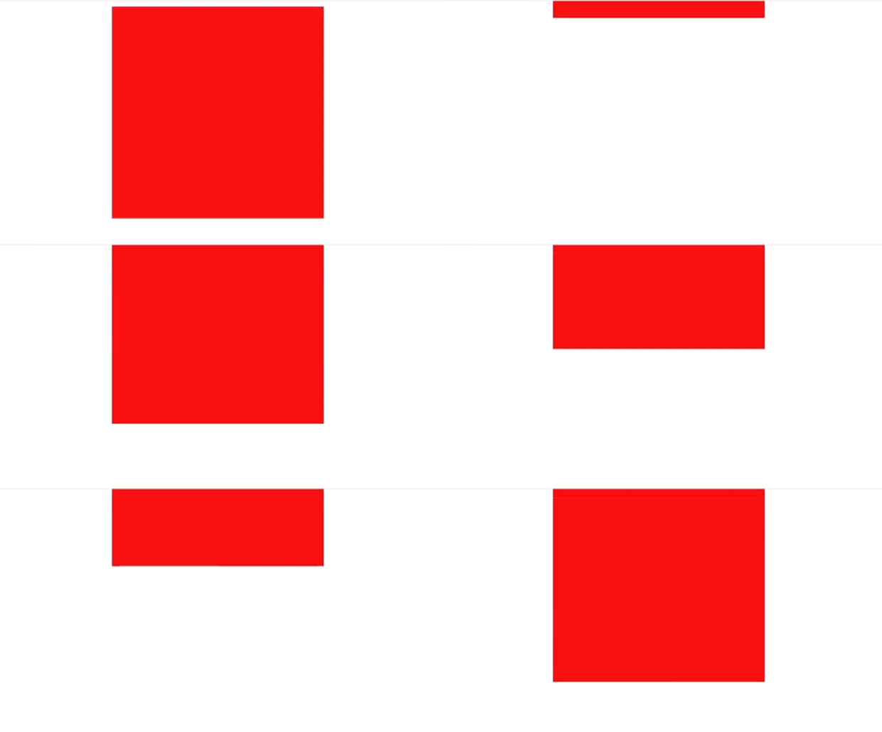
This element is animated with the CSS animation bounce, which causes it to continuously bounce up and down.
The bounce animation is defined using keyframes, with three keyframes:
- At 0% and 100% completion, the element’s transform property is set to translateY(0), meaning it stays in its original position.
- At 50% completion, the element is shifted vertically up by 100% of its height, resulting in the bounce effect.
This animation moves the ball vertically, imitating a bounce effect by changing its location at different percentages of the animation time.
2. Animation Properties of CSS Animation
CSS animation properties allow developers to precisely control how items move, transform, and transition on a web page. These features allow you to create appealing animations without using JavaScript or external libraries.
Syntax
animation: name duration timing-function delay iteration-count direction fill-mode play-state;Here are some key CSS animation properties to familiarize yourself with:
2.1. animation-name
This property contains the name of the keyframe animation that you want to apply to an element. You can construct custom animations by defining keyframes using @keyframes rule sets and assigning them to elements using the animation-name property.
2.2. animation-duration
The animation-duration attribute specifies the duration of the animation. You can choose the duration in seconds or milliseconds, allowing you to adjust the speed at which the animation plays.
2.3. animation-timing-function
This parameter defines the timing function that controls the animation’s progress. Timing functions such as ease, linear, ease-in, ease-out, and ease-in-out affect the animation’s acceleration and deceleration, hence influencing its overall feel and flow.
- Ease: This timing function begins the transition slowly, accelerates in the middle, and then slows down near the finish. It is widely used to create smooth, natural transitions.
- Ease-in: With this timing function, the transition begins gently and accelerates as it goes. It does not have the same slowdown at the conclusion as ease.
- Ease-out: This timing function is the reverse of ease-in. It starts rapidly and slows down towards the finish. This results in a smooth transition that feels like it is coming to a gradual stop.
- Linear: In contrast to the ease functions, linear produces a transition with a consistent speed from beginning to end. There is no acceleration or deceleration; the animation moves at a steady pace.
- Cubic-bezier: This is a more customisable timing function that allows you to create your own acceleration curve using CSS’s cubic-bezier() function. It allows you to precisely manage the transition’s pace by altering four control points that determine the acceleration curve.
Syntax
cubic-bezier(x1, y1, x2, y2)Here’s what each parameter represents
- x1: x1 is the x-coordinate of the first control point (P1). It determines how much the transition accelerates or decelerates initially.
- y1: The y-coordinate for the initial control point (P1). It calculates the rate of change for acceleration or deceleration at the start of the transition.
- x2: The x-coordinate for the second control point (P2). It determines how much the transition accelerates or decelerates at the end.
- y2: The y-coordinate for the second control point (P2). It calculates the rate of change for acceleration or deceleration at the end of the transition.
let’s look at an example
Let’s look at the ball bouncing animation using custom control points:
Output :

<!DOCTYPE html>
<html lang="en">
<head>
<meta charset="UTF-8">
<meta name="viewport" content="width=device-width, initial-scale=1.0">
<title>Cubic Bezier Bouncing Animation Example</title>

<style>

.ball {
    width: 100px;
    height: 100px;
    background-color: #df6412;
    border-radius: 50%;
    position: absolute;
    top: 50%;
    left: 50%;
    animation: bounce 1.5s cubic-bezier(0.68, -0.55, 0.265, 1.55) infinite;
  }

  @keyframes bounce {
    0%, 100% {
      transform: translateY(0);
    }
    50% {
      transform: translateY(-100px);
    }
  }

</style>
</head>
<body>
<div class="ball"></div>
</body>
</html>
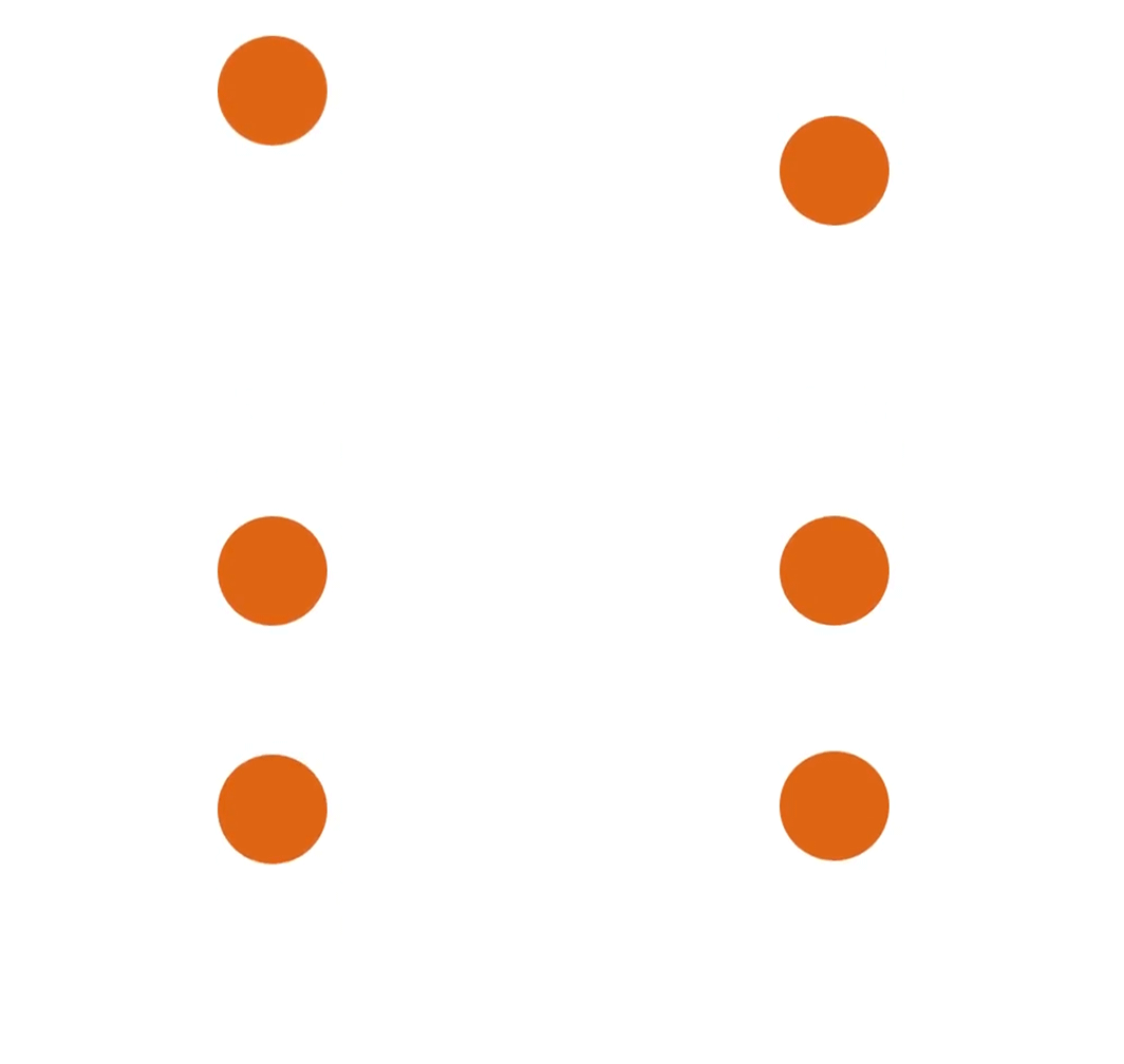
In this example
- The animation property adds a bouncing effect to the ball element by using keyframe animations.
- The cubic Bézier timing function used in the animation is defined by the cubic-bezier(0.68, -0.55, 0.265, 1.55) function, with specific control points.
- The bounce keyframes animation create the bounce effect, starting from the initial state (0%) to halfway (50%) where the ball is translated upward by 100px (translateY(-100px)) and then returning to the initial state (100%).
- By adjusting the control points of the cubic Bézier curve, you may customise the timing and behaviour of the bouncing animation to produce desired results.
2.4. animation-delay
The animation-delay property allows you to add a delay before an animation begins. This delay can be used to stagger animations over numerous elements or to generate suspense before an element moves or transitions.
2.5. animation-iteration-count
This attribute determines how many times an animation should repeat. You can set it to a fixed number (2, 3, etc.), infinite for continuous looping, or alternate to switch between forward and backward repeats.
2.6. animation-direction
The animation-direction attribute controls whether an animation plays forwards, backwards, or alternates between the two. The values are normal, reverse, alternate, and alternate-reverse.
let’s look at an example
Output :

<!DOCTYPE html>
<html lang="en">
<head>
<meta charset="UTF-8">
<meta name="viewport" content="width=device-width, initial-scale=1.0">
<title>CSS Animation Example</title>
<style>
.box {
    width: 200px;
    height: 200px;
    background-color: rgb(147, 80, 255);
    animation: slide 2s ease-in-out 1s infinite alternate;
  }


  @keyframes slide {
    0% {
      transform: translateX(0);
    }
    100% {
      transform: translateX(200px);
    }
  }
  .paused {
    animation-play-state: paused;
  }

</style>
</head>
<body>
<div class="box"></div>
<button onclick="toggleAnimation()">Toggle Animation</button>

<script>
    function toggleAnimation() {
      var box = document.querySelector('.box');
      box.classList.toggle('paused');
    }
  </script>

</body>
</html>
in this example
Keyframes
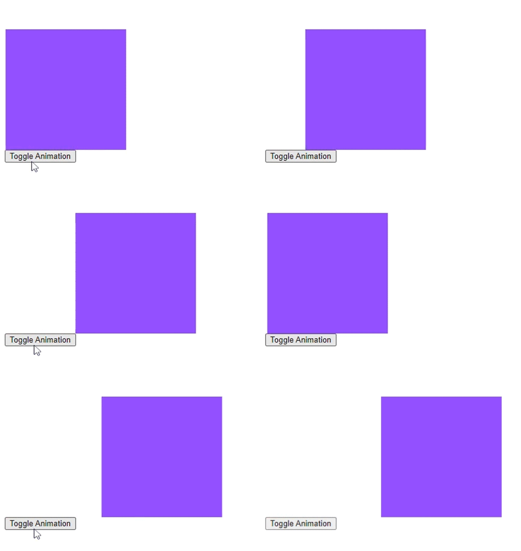
The @keyframes slide rule specifies the keyframes for the slideshow animation. It begins at the element’s initial position (0% completion) and concludes with a 200-pixel translation along the X-axis (100% complete).
The.box class specifies a square element with a width and height of 100 pixels, which is coloured coral. The motion attribute applies the slide animation to this element, causing it to travel horizontally 200 pixels to the right from its starting position. This animation lasts two seconds, begins with an ease-in-out timing function after a one-second wait, and repeats infinitely in an alternating direction.
Interactive Control
JavaScript
- function toggleAnimation() { … }: This JavaScript function is executed when the button is clicked.
- var box = document.querySelector(‘.box’);: This line selects the element with the class .box.
- box.classList.toggle(‘paused’);: This line toggles the presence of the .paused class on the .box element, which pauses or resumes the animation depending on its current state.
Button
<button onclick=”toggleAnimation()”>Toggle Animation</button>: This button toggles the animation when clicked by calling the toggleAnimation() function.
3. Transitions
CSS transitions allow you to smoothly animate the transition of a CSS property from one state to another over a set time. Transitions allow you to create dynamic effects to your web elements by changing their colour, size, location, or any other CSS property.
Syntax and Usage
The syntax for specifying a CSS transition is simple. You provide which CSS property you want to animate, as well as the duration and timing function for the transition.
Syntax
.element {
  transition: property duration timing-function delay;
}
- property: Choose the CSS attribute to animate (e.g., colour, opacity, transform).
- duration: Transition duration in seconds (e.g., 1s or 500ms).
- timing-function: The timing function determines the acceleration and deceleration of the transition. Common values are ease, ease-in, ease-out, linear, and cubic-bezier.
- delay: optional. specifies a delay before the transition begins (e.g., 0.5 seconds).
Assume you want to make a smooth colour transition when hovering over a button.
Output :

<!DOCTYPE html>
<html lang="en">
<head>
<meta charset="UTF-8">
<meta name="viewport" content="width=device-width, initial-scale=1.0">
<title>CSS Transition Example</title>

<style>

.button {
    padding: 40px 80px;
    background-color: #4CAF50;
    color: white;
    border: none;
    transition: background-color 0.3s ease;
    font-size: 50px;
  }

  .button:hover {
    background-color: #a04598;
  }

</style>
</head>
<body>
<button class="button">Hover Me</button>
</body>
</html>
Explanation
- Begin with the usual HTML structure, adding a button element with the class “button.”
- In the CSS section, we define the button’s basic styling, including padding, background colour, and text colour.
- The crucial part is the transition property applied to the .button class. We use the ease timing function to create a smooth transition for the background-color property over 0.3 seconds. It means that if the background colour changes, it will transition smoothly throughout the set time period.
- We add a:hover pseudo-class to the button. When you hover over the button, the background colour changes to a little different shade, resulting in a visual feedback effect.
- Using the transition property ensures a smooth transition in background colour during hover.
Benefits of CSS Animation Properties
1. Performance Optimization
CSS animations use hardware acceleration and native browser rendering capabilities, resulting in smoother performance than JavaScript-based animations. This optimisation provides a consistent user experience, particularly on mobile devices and low-powered systems.
2. Simplified Implementation
CSS animation property allow developers to build complex animations with minimal code. By specifying animation behaviour directly in CSS, you eliminate your reliance on other scripts and libraries, speeding the development process and improving code maintenance.
3. Cross-Browser Compatibility
CSS animations are supported by most recent web browsers, ensuring uniform animation behaviour across all platforms and devices. This broad compatibility makes cross-browser testing easier and increases the accessibility of animated web content.
Conclusion
CSS animation features give developers a variety of tools to create visually beautiful and interactive web experiences. By mastering these features and integrating them in new ways, developers can bring their designs to life and increase user engagement. CSS animations are best learned through experimentation and practice.
