Table of Contents
CSS has progressed greatly over time, introducing a number of advanced selectors that improve the ability to style web pages with precision and flexibility. One of the most recent additions to the CSS selector is the :has() pseudo-class. This blog will go over the details of the :has() selector, including its usage, benefits, and practical examples to help you use this powerful tool in your web development projects.
What is the :has() Selector?
The :has() selector is a relational pseudo-class that lets you choose an element depending on the presence of a descendant or a more complicated relationship within its subtree. In simpler terms, it allows you to style a parent element if it contains specific child components.
Syntax:
The basic syntax of the :has() selector is as follows:
element:has(selector) {
  /* CSS properties */
}
Key Features
- Relational Selection: Unlike typical CSS selectors, which focus on the element or its immediate children, :has() selector looks at the content within the element to see if it fits a specified conditions.
- Dynamic Styling: It can dynamically apply styles based on the presence or absence of specific elements, resulting in more interactive and context-aware designs.
Practical Examples of :has() Selector :
1. Highlight Parent Element using :has selector:
Output:

HTML:
<!DOCTYPE html>
<html lang="en">
<head>
    <meta charset="UTF-8">
    <meta name="viewport" content="width=device-width, initial-scale=1.0">
    <title>Highlight Parent Element</title>
</head>
<body>
    <div class="parent">
        <span class="highlight">This is important</span>
    </div>
    <div class="parent">
        <span>This is not important</span>
    </div>
    <div class="parent">
        <span class="highlight">Another important message</span>
    </div>
    <div class="parent">
        <span>Just some text</span>
    </div>
</body>
</html>
CSS:
body
        {
            width: 1000px;
            margin: 0 auto;
        }

.parent {
    padding: 10px;
    margin: 10px;
    border: 1px solid #ccc;
}

.parent:has(.highlight) {
    background-color: yellow;
    border-color: red;
}- width: 1000px; : This adjusts the width of the body element to 1000 pixels. It limits the overall content width of the webpage to 1000 pixels.
- margin: 0 auto; : This is a shorthand for determining the margin. 0 auto indicates that the top and bottom margins are set to zero, while the left and right margins are set to auto. The auto value centres the body element horizontally in the viewer. When coupled with a fixed width (1000px), this will centre the content on the page.
- .parent:has(.highlight): This CSS selector targets.parent items that have at least one descendant with the class highlight. The:has() pseudo-class is part of the CSS Selectors Level 4 specification, although it is not yet widely supported by all browsers, thus use with caution in production contexts.
In this example:
- The first .parent div does not contain a .highlight element, so it will have the default styling: a light gray border and no background color.
- The second .parent div contains a .highlight element, so it will have a yellow background and a red border.
Final Output Summary:
The rendered webpage will have two sections (div) with different styles:
- The first section will have a light gray border and no special background color.
- The second section will have a red border and a yellow background because it contains an element with the class highlight.
2. Highlight Form field using :has selector
Output:
HTML
<!DOCTYPE html>
<html lang="en">
<head>
    <meta charset="UTF-8">
    <meta name="viewport" content="width=device-width, initial-scale=1.0">
    <title>Highlight Form </title>
</head>
<body>
    <form>
        <label for="username">Username:</label>
        <input type="text" id="username" name="username">
    </form>

    <form>
        <label for="password">Password:</label>
        <input type="password" id="password" name="password">
    </form>
    <form>
        <label for="email">Email:</label>
        <input type="email" id="email" name="email">
    </form>
    <form>
        <label for="userpass">User Password:</label>
        <input type="password" id="userpass" name="userpass">
    </form>
</body>
</html>
CSS:
body
        {
            width: 1000px;
            margin: 0 auto;
        }
        form {
            padding: 20px;
            margin: 20px;
            border: 1px solid #ccc;
        }

        form:has(input[type="password"]) {
            background-color: #f0f8ff;
        }
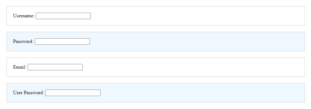
- The :has pseudo-class is a powerful CSS selector that targets elements containing specific child elements. In this case, it’s used to style forms that contain a password input field.
- Selector: form:has(input[type=”password”]) targets any form element that contains an input element of type “password”.
- Background Color: background-color: #f0f8ff; changes the background color of the targeted form to a light blue (#f0f8ff).
This conditional styling is useful for highlighting forms that require sensitive information, such as passwords, making them stand out and capturing the user’s attention.
3. Styled list with specific elements using :has selector
Output:
HTML:
<!DOCTYPE html>
<html lang="en">
<head>
  <meta charset="UTF-8">
  <meta name="viewport" content="width=device-width, initial-scale=1.0">
  <title>Styled List Items with Content</title>
</head>
<body>
  <ul class="list">
    <li>Item 1</li>
    <li>Item 2</li>
    <li>Item 3</li>
    <li>Item 4 <span class="highlight">Special</span></li>
    <li>Item 5</li>
    <li>Item 6 <span class="highlight">Special</span></li>
    <li>Item 7</li>
  </ul>
</body>
</html>
CSS:
body {
  font-family: Arial, sans-serif;
  display: flex;
  justify-content: center;
  align-items: center;
  height: 100vh;
  margin: 0;
  background-color: #f5f5f5;
}

.list {
  list-style: none;
  padding: 0;
  margin: 0;
}

.list li {
  padding: 10px;
  border-bottom: 1px solid #ddd;
}

.list li:has(.highlight) {
  background-color: #e6e6e6;
}

.highlight {
  background-color: #ffc107;
  color: #333;
  padding: 2px 4px;
  border-radius: 4px;
}
- The .list class removes the default list styling (bullets) and padding/margin for the list items.
- The .list li selector adds padding to each list item and a bottom border to visually separate them.
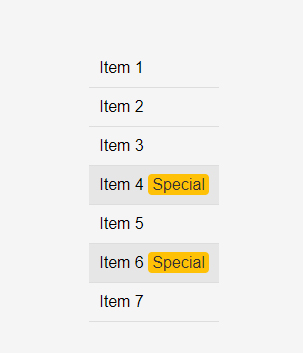
- The .list li:has(.highlight) selector uses the :has pseudo-class to target list items containing a .highlight class, changing their background color to a light grey.
- The .highlight class styles specific text within the list items, setting a background color, text color, padding, and rounded corners for emphasis.
Within the list, some items contain a element with the class .highlight. These spans are styled differently to stand out, making it easy to identify special or important content.
4. Interactive Shopping Cart using :has Selector
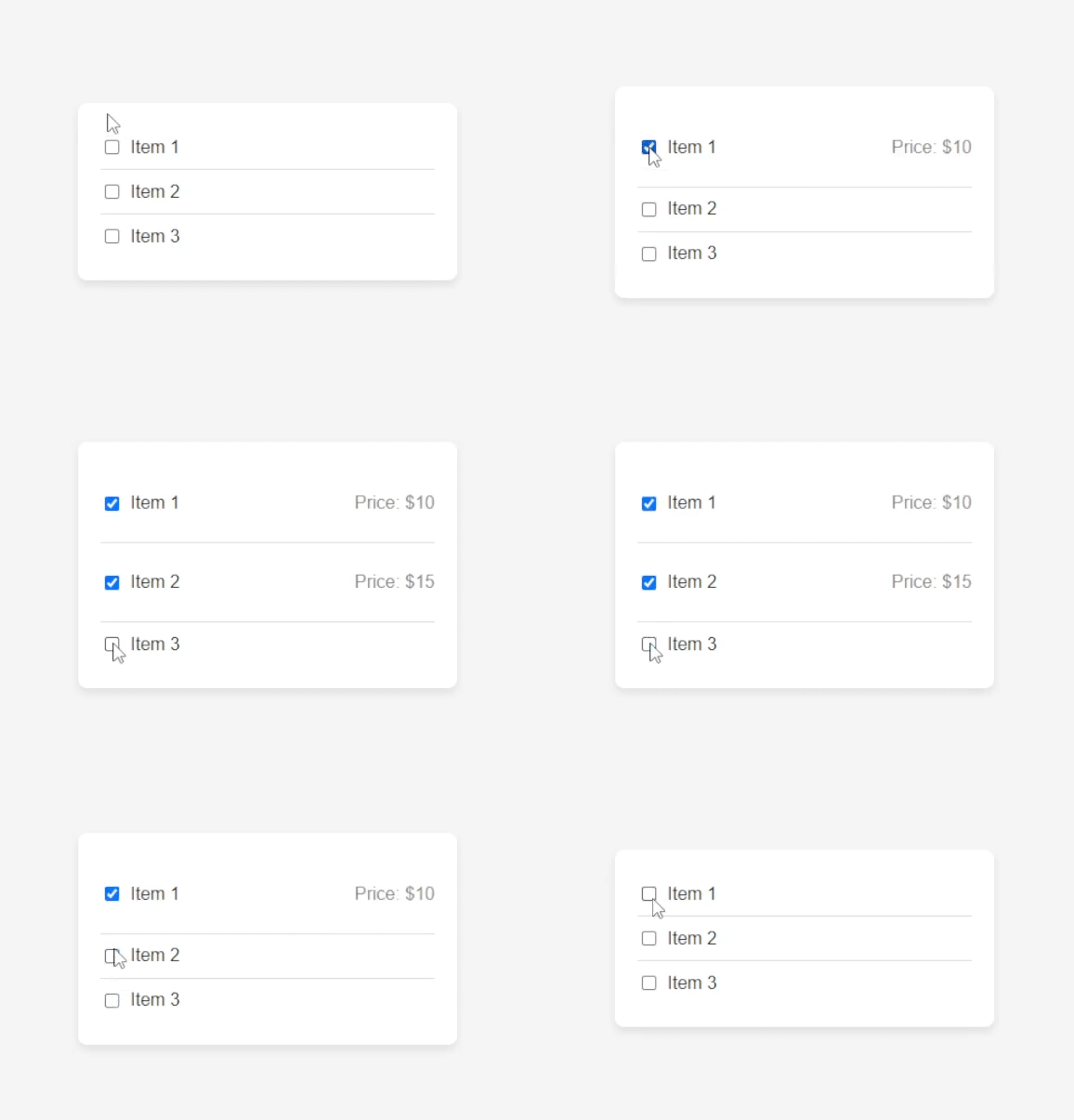
This CSS code centres a shopping cart on the screen using a flexbox layout and gives it a clean, modern appearance. The cart items are presented horizontally with checkboxes, and extra information is displayed only when the checkbox is selected. This results in an engaging and visually appealing shopping cart interface.
Output
HTML:
<!DOCTYPE html>
<html lang="en">
<head>
  <meta charset="UTF-8">
  <meta name="viewport" content="width=device-width, initial-scale=1.0">
  <title>Interactive Shopping Cart</title>
</head>
<body>
  <div class="shopping-cart">
    <div class="cart-item">
      <input type="checkbox" id="item1">
      <label for="item1">Item 1</label>
      <p class="details">Price: $10</p>
    </div>
    <div class="cart-item">
      <input type="checkbox" id="item2">
      <label for="item2">Item 2</label>
      <p class="details">Price: $15</p>
    </div>
    <div class="cart-item">
      <input type="checkbox" id="item3">
      <label for="item3">Item 3</label>
      <p class="details">Price: $20</p>
    </div>
  </div>
</body>
</html>
CSS:
body {
  font-family: Arial, sans-serif;
  display: flex;
  justify-content: center;
  align-items: center;
  height: 100vh;
  margin: 0;
  background-color: #f5f5f5;
}

.shopping-cart {
  background: #fff;
  border-radius: 8px;
  box-shadow: 0 4px 8px rgba(0, 0, 0, 0.1);
  padding: 20px;
  width: 300px;
}

.cart-item {
  display: flex;
  align-items: center;
  border-bottom: 1px solid #ddd;
  padding: 10px 0;
}

.cart-item:last-child {
  border-bottom: none;
}

.cart-item input[type="checkbox"] {
  margin-right: 10px;
}

.cart-item .details {
  display: none;
  margin-left: auto;
  color: #888;
}

.cart-item:has(input:checked) .details {
  display: block;
}
display: flex;: Applies a flexbox layout to the body element.
The Basics of display: flex:
When you apply display: flex to a container element, it transforms into a flex container, with direct children becoming flex items. Flexbox has a one-dimensional layout model, which means that it can arrange things in a row (horizontally) or a column (vertically), but not both at the same time.
Click here for a detailed explanation of the flex property.
- justify-content: center;: Centers the content horizontally.
- align-items: center;: Centers the content vertically.
- height: 100vh;: Sets the height of the body to 100% of the viewport height.
- border-radius: 8px;: Rounds the corners of the container.
- border-bottom: none;: Removes the bottom border for the last cart item.
- :has(input:checked): Targets the cart item if it contains a checked input.
- box-shadow: 0 4px 8px rgba(0, 0, 0, 0.1);: Adds a subtle shadow around the container for a raised effect.
box-shadow: 0 4px 8px rgba(0, 0, 0, 0.1); declaration to understand each parameter:
The box-shadow property in CSS is used to create shadow effects around an element’s frame. The syntax for the box-shadow property is given below:
box-shadow: offset-x offset-y blur-radius spread-radius color;- offset-x (0): This option controls the horizontal offset of the shadow. A positive value shifts the shadow to the right; a negative value shifts it to the left. In this situation, 0 indicates no horizontal offset, thus the shadow is directly below the element.
- offset-y (4px): This option controls the vertical offset of the shadow. A positive value shifts the shadow below, whereas a negative value shifts it upwards. Here, 4px denotes that the shadow is 4 pixels below the element.
- blur-radius (8px): This option controls the blur radius of the shadow. The greater the value, the blurrier the shadow will appear. 8px creates a relatively soft shadow with a noticeable blur.
- spread-radius (0 by default if not specified): This option determines the size of the shadow. A positive value causes the shadow to expand and grow larger, while a negative value shrinks it. It is not specifically stated in this example, thus it defaults to 0, implying that the shadow size remains unchanged.
- color (rgba(0, 0, 0, 0.1)): This parameter controls the colour of the shadow. The rgba function represents red, green, blue, and alpha (opacity). Here, rgba(0, 0, 0, 0.1) denotes a black colour (rgb(0, 0, 0)) with 10% opacity (0.1). This creates a very delicate and light shadow.
5. Interactive Profile Card using :has Selector
Output:

HTML
<!DOCTYPE html>
<html lang="en">
<head>
  <meta charset="UTF-8">
  <meta name="viewport" content="width=device-width, initial-scale=1.0">
  <title>Interactive Profile Card</title>
</head>
<body>
  <div class="profile-card">
    <img src="profile.jpg" alt="Profile Picture" class="profile-picture">
    <h2>John Doe</h2>
    <p class="title">Software Engineer</p>
    <div class="details">
      <p>Email: [email protected]</p>
      <p>Phone: +1234567890</p>
    </div>
  </div>
</body>
</html>
CSS
body {
  font-family: Arial, sans-serif;
  display: flex;
  justify-content: center;
  align-items: center;
  height: 100vh;
  margin: 0;
  background-color: #f5f5f5;
}

.profile-card {
  background: #fff;
  border-radius: 10px;
  box-shadow: 0 4px 8px rgba(0, 0, 0, 0.1);
  width: 300px;
  padding: 20px;
  text-align: center;
  transition: all 0.3s ease;
  position: relative;
}

.profile-card img.profile-picture {
  width: 100px;
  height: 100px;
  border-radius: 50%;
  margin-bottom: 10px;
}

.profile-card .title {
  color: grey;
  font-size: 18px;
  margin: 10px 0;
}

.profile-card .details {
  display: none;
  text-align: center;
}

.profile-card:has(:hover) .details,
.profile-card:has(:focus-within) .details {
  display: block;
}

.profile-card:has(:hover),
.profile-card:has(:focus-within) {
  box-shadow: 0 8px 16px rgba(0, 0, 0, 0.2);
}
- display: flex;: Applies Flexbox layout to the body element.
Learn more about display: Flex. - justify-content: center;: Horizontally centers the content within the body.
- height: 100vh;: Sets the height of the body to 100% of the viewport height.
- border-radius: 10px;: Rounds the corners to a radius of 10 pixels.
- box-shadow: 0 4px 8px rgba(0, 0, 0, 0.1);: Adds a faint shadow with a vertical offset of 4 pixels and an 8-pixel blur radius.
Learn more about box shadow. - transition: all 0.3s ease;: Smoothly transitions all properties over 0.3 seconds.
- display: none;: Hides the .details element by default.
- :has(:hover) .details and :has(:focus-within) .details:
When hovering over the.profile-card or focusing on a child element, the.details element becomes visible (display: block). - :has(:hover) and :has(:focus-within):
When the.profile-card is hovered over or focused, the shadow becomes more visible (box-shadow: 0 8px 16px rgba(0, 0, 0, 0.2);).
These styles work together to create a profile card that is centred on the page, with a smooth transition effect and interactive states that show additional information when hovered or focused.
6. Parent Highlight on Child Focus using :has Selector
Output:
HTML
<!DOCTYPE html>
<html lang="en">
<head>
  <meta charset="UTF-8">
  <meta name="viewport" content="width=device-width, initial-scale=1.0">
  <title>Parent Highlight on Child Focus</title>
</head>
<body>
  <div class="container">
    <div class="highlight">
      <input type="text" placeholder="Focus me!">
    </div>
    <div class="highlight">
      <input type="text" placeholder="Or me!">
    </div>
  </div>
</body>
</html>
CSS
body {
  font-family: Arial, sans-serif;
  display: flex;
  justify-content: center;
  align-items: center;
  height: 100vh;
  margin: 0;
  background-color: #f5f5f5;
}

.container {
  display: flex;
  flex-direction: column;
  gap: 10px;
}

.highlight {
  padding: 10px;
  border: 2px solid transparent;
  border-radius: 4px;
  background-color: #fff;
  box-shadow: 0 4px 8px rgba(0, 0, 0, 0.1);
}

.highlight:has(input:focus) {
  border-color: #007BFF;
  background-color: #e6f2ff;
}

input {
  width: 100%;
  padding: 8px;
  box-sizing: border-box;
  border: 1px solid #ddd;
  border-radius: 4px;
}
- display: flex;: Applies Flexbox layout to the body element.
Learn more about display: Flex. - box-shadow: 0 4px 8px rgba(0, 0, 0, 0.1); – Adds a shadow effect below the element with a slight blur and offset.
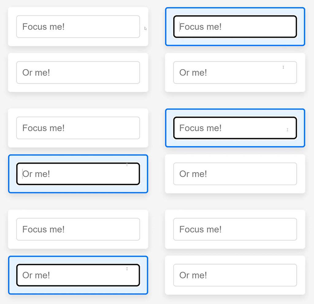
Learn more about box shadow. - .highlight:has(input:focus) Selector:
border-color: #007BFF; – Changes the border color to a blue shade when any input inside the .highlight element is focused.
background-color: #e6f2ff; – When any input is focused inside the.highlight element, the background colour changes to a light blue.
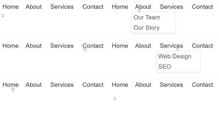
7. Stylish and Functional Navigation Menu using :has Selector
An elegant and useful navigation menu is essential for any website. It ensures that users can navigate easily, which improves their overall experience.
Output:
HTML
<!DOCTYPE html>
<html>
<head>
    <meta charset='utf-8'>
    <meta http-equiv='X-UA-Compatible' content='IE=edge'>
    <title>Navigation Bar</title>
    <meta name='viewport' content='width=device-width, initial-scale=1'>
    <link rel='stylesheet' type='text/css' media='screen' href='main.css'>
</head>
<body>
    <nav class="menu">
        <ul>
            <li><a href="#">Home</a></li>
            <li>
                <a href="#">About</a>
                <ul class="submenu">
                    <li><a href="#">Our Team</a></li>
                    <li><a href="#">Our Story</a></li>
                </ul>
            </li>
            <li>
                <a href="#">Services</a>
                <ul class="submenu">
                    <li><a href="#">Web Design</a></li>
                    <li><a href="#">SEO</a></li>
                </ul>
            </li>
            <li><a href="#">Contact</a></li>
        </ul>
    </nav>
    </body>
</html>
CSS:
.menu ul {
    list-style: none;
    padding: 0;
    margin: 0;
    display: flex;
}

.menu li {
    position: relative;
}

.menu a {
    display: block;
    padding: 10px 20px;
    text-decoration: none;
    color: #333;
}

.menu ul.submenu {
    display: none; /* Hide sub-menus by default */
    position: absolute;
    top: 100%;
    left: 0;
    background-color: #fff;
    border: 1px solid #ddd;
    box-shadow: 0 4px 8px rgba(0, 0, 0, 0.1);
}

/* Show sub-menus when hovering over a parent li */
.menu li:hover > ul.submenu {
    display: block;
}

/* Additional styling when a menu item has a submenu */
.menu li:has(ul.submenu) > a {
    padding-right: 30px; /* Space for the arrow */
    background-image: url('arrow-down.svg'); /* An arrow icon indicating a submenu */
    background-repeat: no-repeat;
    background-position: right center;
}

/* Optional: Style the submenu items */
.menu ul.submenu li {
    width: 200px;
}

.menu ul.submenu a {
    padding: 10px;
    color: #666;
}

.menu ul.submenu a:hover {
    background-color: #f0f0f0;
}
- display: flex; makes the list items display in a row (flexbox layout).
- list-style: none; removes the default bullets from the list items.
- position: relative; allows for absolutely positioned elements (like submenus) to be positioned relative to these list items.
- box-shadow: 0 4px 8px rgba(0, 0, 0, 0.1); adds a subtle shadow to the submenu for a floating effect.
- .menu li:has(ul.submenu) > a targets anchor tags within list items that contain submenus.
In CSS, the > sign is referred to as the child combinator. It is used to find elements that are direct children of an element. This means that the element on the right side of the > should be a direct child of the element on the left side of the >.
The selector is used to select a elements that are direct children of li elements, where these li elements contain a ul element with the class submenu.
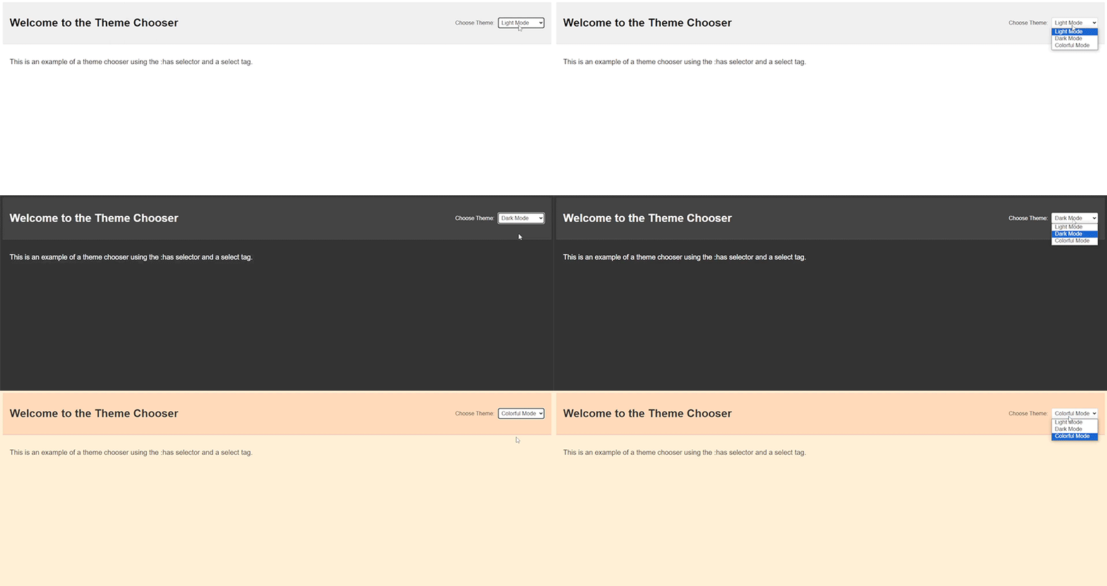
8. Theme Chooser using :has Selector
Output:
HTML
<!DOCTYPE html>
<html lang="en">
<head>
    <meta charset="UTF-8">
    <meta name="viewport" content="width=device-width, initial-scale=1.0">
    <title>Theme Chooser</title>
</head>
<body>
    <header>
        <h1>Welcome to the Theme Chooser</h1>
        <div class="theme-selector">
            <label for="theme-select">Choose Theme:</label>
            <select id="theme-select">
                <option value="light">Light Mode</option>
                <option value="dark">Dark Mode</option>
                <option value="colorful">Colorful Mode</option>
            </select>
        </div>
    </header>
    <main>
        <p>This is an example of a theme chooser using the :has selector and a select tag.</p>
    </main>
</body>
</html>
CSS
body {
    font-family: Arial, sans-serif;
    background-color: #fff;
    color: #000;
    transition: background-color 0.3s, color 0.3s;
}

/* Header styling */
header {
    display: flex;
    justify-content: space-between;
    align-items: center;
    padding: 20px;
    background-color: #f0f0f0;
    border-bottom: 1px solid #ddd;
}

/* Align the theme selector to the right */
.theme-selector {
    display: flex;
    align-items: center;
    margin-left: auto;
}

/* Space between label and select */
.theme-selector label {
    margin-right: 10px;
}

/* Light Mode (Default) */
body {
    --bg-color: #fff;
    --text-color: #000;
    --header-bg-color: #f0f0f0;
    --header-border-color: #ddd;
}

/* Dark Mode styles using the :has selector */
:has(#theme-select option:checked[value="dark"]) body {
    --bg-color: #333;
    --text-color: #fff;
    --header-bg-color: #444;
    --header-border-color: #555;
}

/* Colorful Mode styles using the :has selector */
:has(#theme-select option:checked[value="colorful"]) body {
    --bg-color: #ffefd5;
    --text-color: #333;
    --header-bg-color: #ffdab9;
    --header-border-color: #eea2ad;
}

/* Applying CSS variables */
body {
    background-color: var(--bg-color);
    color: var(--text-color);
}

header {
    background-color: var(--header-bg-color);
    border-bottom: 1px solid var(--header-border-color);
}

/* Style for the main content */
main {
    padding: 20px;
}

/* Select tag styling */
select {
    padding: 5px;
    font-size: 16px;
    border: 1px solid #ccc;
    border-radius: 4px;
}
Using variables in CSS, especially custom properties (variables), has various benefits that make stylesheets easier to manage, maintain, and extend. Here is why variables are used in the provided CSS.
Variables allow you to define a value once and reuse it throughout your stylesheet.
For instance:
body {
    --bg-color: #fff;
    --text-color: #000;
    --header-bg-color: #f0f0f0;
    --header-border-color: #ddd;
}
These variables can then be utilised wherever needed, ensuring consistency and saving you from repeating the same value several times.
body {
    background-color: var(--bg-color);
    color: var(--text-color);
}

header {
    background-color: var(--header-bg-color);
    border-bottom: 1px solid var(--header-border-color);
}
If you have to change a colour scheme or any other reusable property, you simply need to edit the variable value once, rather than hunting down each instance of the value in your CSS:
:has(#theme-select option:checked[value="dark"]) body {
    --bg-color: #333;
    --text-color: #fff;
    --header-bg-color: #444;
    --header-border-color: #555;
}
The :has pseudo-class is a powerful CSS selector that enables you to style an element based on the presence of a descendant element that meets a specific condition. Within this context:
:has(#theme-select option:checked[value="dark"])
This means the styles will be applied to the body element if there is an option element with the value “dark” that is checked within the #theme-select element.
option:checked[value=”dark”] targets an option element within the select that:
- Is checked (selected).
- Has a value attribute of “dark”.
The CSS rule you provided uses the :has pseudo-class in combination with CSS variables to implement a dynamic theming system.
9. Five Star Rating with :has Selector
Output:

HTML
<!DOCTYPE html>
<html lang="en">
<head>
<meta charset="UTF-8">
<meta name="viewport" content="width=device-width, initial-scale=1.0">
<title>5 Star Rating with :has Selector</title>
</head>
<body>

<div class="rating">
  <input type="radio" id="star5" name="rating" value="5">
  <label for="star5">★</label>
  <input type="radio" id="star4" name="rating" value="4">
  <label for="star4">★</label>
  <input type="radio" id="star3" name="rating" value="3">
  <label for="star3">★</label>
  <input type="radio" id="star2" name="rating" value="2">
  <label for="star2">★</label>
  <input type="radio" id="star1" name="rating" value="1">
  <label for="star1">★</label>
</div>

</body>
</html>
CSS:
.rating {
    display: inline-flex;
    flex-direction: row-reverse;
    font-size: 2rem;

  }

  .rating input {
    display: none;
  }

  .rating label {
    cursor: pointer;
    color: lightgray;
    margin-left: 10px;

  }

  .rating input:checked ~ label,
  .rating input:checked ~ label ~ label {
    color: gold;
  }

  .rating label:hover,
  .rating label:hover ~ label {
    color: gold;
  }

  /* Using the :has() selector for more advanced interactions */
  .rating:has(input:checked) label {
    color: lightgray;
  }

  .rating:has(input:checked) input:checked ~ label,
  .rating:has(input:checked) input:checked ~ label ~ label {
    color: gold;
    transform: scale(1.3);
    transition: all .2s ease-in-out;
  }
- display: inline-flex;: This makes the.rating element to behave as an inline-level flex container, aligning its child elements (likely the stars) in a row.
- flex-direction: row-reverse;: This reverses the order of the child elements, so the last element appears first. This is useful for rating systems that require the stars to be filled from right to left.
- display: none;: This hides the input items. The inputs are still operational, but not visible. They are most likely used to capture rating values.
- cursor: pointer;: This changes the cursor to a pointer when hovering over the labels, indicating that they are clickable.
- .rating input:checked ~ label, .rating input:checked ~ label ~ label : This rule changes the color of the labels (stars) to gold when an input is checked. The ‘ ~ ‘ (general sibling) combinator applies the style to all subsequent sibling labels after the checked input.
.rating:has(input:checked) input:checked ~ label,
.rating:has(input:checked) input:checked ~ label ~ label {
    color: gold;
    transform: scale(1.3);
    transition: all .2s ease-in-out;
}
This rule styles the checked input and any subsequent sibling labels. It transforms their color to gold and scales them up 1.3 times. The transition attribute guarantees that the scaling impact occurs smoothly over 0.2 seconds.
This CSS generates an interactive star rating component. The stars are designed as labels for hidden radio inputs. When a user hovers over or picks a star, the stars change colour to gold to indicate the rating. In addition, selected stars are scaled up somewhat for visual emphasis, and the entire effect is smooth thanks to the transition options.
Benefits of Using :has() :
Enhanced Readability: The:has() selector can improve your CSS readability and maintainability by eliminating the need for complex JavaScript for some style chores.
Improved Performance: By using CSS for tasks that would normally need JavaScript, you might potentially increase the efficiency and responsiveness of your web pages.
Greater Flexibility: It allows for more flexibility in styling items based on their content and structure, resulting in more subtle and dynamic designs.
Browser Support
As of this writing, the:has() selector is a relatively recent feature to CSS, and its support may vary by browser. Check for current browser compatibility and, if necessary, use fallbacks or polyfills.
Conclusion
The:has() selector is an extremely useful element in current CSS, allowing developers to construct more dynamic and context-aware styles. Understanding and utilising this selection allows you to improve the interactivity and visual attractiveness of your online projects while keeping the code clear and maintainable.
Experiment with the:has() selector in your projects to see how it can help simplify your CSS and create more advanced styling results. As browser support improves, the:has() selector is poised to become a key tool in the toolkit of web developers.
