Table of Contents
What is Translate Property in CSS?
CSS translate property moves an element along the X and Y axes. Unlike other positioning attributes, such as position, translate does not disrupt the document’s natural flow, making it excellent for producing smooth animations and transitions.
What is Transform property in CSS
Visually appealing and dynamic user interfaces have become the norm in the ever-changing web development landscape. CSS (Cascading Style Sheets) is a core technology for styling and layout that stands out among the many tools available to developers. The transform property in CSS emerges as a strong technique for controlling the display of items on a web page.
Syntax:
selector {
    transform: transform-function;
}
The term selector refers to the element to which the transformation will be applied, whereas transform-function describes the type of transformation to be done.
Let’s explore some of the most commonly used Translate functions
1. Translate
CSS’s translate() function moves an element along the horizontal and/or vertical axes. CSS provides transformations to modify the location and appearance of items on a web page. The translate() function takes one or two parameters that represent the distances required to shift an element along the x and y axes, respectively.
Here’s how it works:
Syntax
transform: translate(tx, ty);- tx: This represents the horizontal translation value. It can be specified in pixels(px), percentages(%), ems(em), rems(rem), viewport units(vw/vh), or any other valid length unit.
- ty: This represents the vertical translation value. It follows the same rules and units as tx.
lets see simple example
CSS Translate property: Translate an element horizontally using keyframes
Output :

This CSS code specifies a basic animation in which a red square element moves horizontally across the screen from left to right multiple times, resulting in a smooth and visually appealing effect. CSS keyframes and the transform property are used to change the element’s position, resulting in the animation.
<!DOCTYPE html>
<html>
<head>
    <meta charset='utf-8'>
    <meta http-equiv='X-UA-Compatible' content='IE=edge'>
    <title>Page Title</title>
    <meta name='viewport' content='width=device-width, initial-scale=1'>
 </head>
<body>
    <div class="animated-element"></div>
</body>
</html>
.animated-element {
  width: 100px;
  height: 100px;
  background-color: #ee3646;
  animation: translateXAnimation 2s infinite alternate; /* Keyframe animation */
}
@keyframes translateXAnimation {
  0% {
    transform: translateX(0);
  }
  100% {
    transform: translateX(200px);
  }
}
- .animated-element: This is a class selector for an HTML element with the class name “animated-element”. The properties defined here will apply to any HTML element with this class.
- The term “translateXAnimation” relates to animations defined with @keyframes.
- The value 2s indicates that the animation will last 2 seconds.
- Infinite means the animation will continue endlessly.
- The animation will play in reverse on each alternate cycle.
@keyframes translateXAnimation:
- This keyframes rule, translateXAnimation, defines the animation’s behaviour at different percentages.
- 0% indicates the animation’s start point.
- 100% indicates the end of the animation.
lets see complex example of css translate property:
i) Sliding menu using CSS with CSS translate property and javascript:
Output:

<!DOCTYPE html>
<html lang="en">
<head>
<meta charset="UTF-8">
<meta name="viewport" content="width=device-width, initial-scale=1.0">
<title>Slide-in Navigation Menu</title>
</head>
<body>

<!-- Menu Toggle Button -->
<button onclick="toggleMenu()">Toggle Menu</button>

<!-- Navigation Menu -->
<div class="menu" id="menu">
    <a href="#" class="menu-item">Home</a>
    <a href="#" class="menu-item">About</a>
    <a href="#" class="menu-item">Services</a>
    <a href="#" class="menu-item">Contact</a>
    <a href="#" class="menu-item" onclick="closeMenu()">Close</a>
</div>
</body>
</html>
.menu {
        position: fixed;
        top: 0;
        left: -250px; /* Initially off-screen */
        height: 100%;
        width: 250px; /* Adjust as needed */
         background-color: #ee3646;
        transition: left 0.3s ease; /* Only transition the left property */
        z-index: 1000; /* Ensure it's above other content */
    }

    .menu.active {
        left: 0; /* Slide the menu into view */
    }

    /* Example styling for menu items */
    .menu-item {
        padding: 10px;
        color: #fff;
        text-decoration: none;
        display: block;
    }
- The .menu class is set to position: fixed, ensuring it remains fixed relative to the viewport while the page scrolls. It is put in the viewport’s top left corner (top: 0, left: 0).
- Dimensions and Styling: The menu has a fixed width of 250 pixels and takes up the entire viewport height (height: 100%). It is distinguished from the rest of the page by its the background colour of red.
- Initial Hidden State: The transform property is used to move the menu out of the viewport horizontally (transform: translateX(-100%);). This means that the menu is positioned completely off-screen to the left.
- Transition Effect: The transition property is applied to the transform property with a period of 0.3 seconds and an ease function. This results in a seamless animation effect when the menu slides in and out.
- Active State: When the.menu element has the.active class, its transform property is set to translateX(0), putting it back into focus.
function toggleMenu() {
        var menu = document.getElementById('menu');
        menu.classList.toggle('active');
    }

    function closeMenu() {
        var menu = document.getElementById('menu');
        menu.classList.remove('active');
    }
toggleMenu Function
- Function Declaration: function toggleMenu() { … }: This declares a function called toggleMenu.
- Getting the Element: var menu = document.getElementById(‘menu’); :This line selects an HTML element with the ID menu and assigns it to the variable menu.
- Toggling the Class: menu.classList.toggle(‘active’); : menu.classList returns the list of classes for the menu element.
- .toggle(‘active’) checks if the class active is present:
- If active is present, it removes it.
- If active is not present, it adds it.
closeMenu Function
- Function Declaration: function closeMenu() { … } This declares a function called closeMenu.
- Getting the Element: var menu = document.getElementById(‘menu’); :This function, like toggleMenu, fetches the HTML element with the ID menu and assigns it to the variable menu.
Removing the Class: menu.classList.remove(‘active’);
- The menu.classList function returns the list of classes for the menu element.
- .remove(‘active’) removes the class active from the menu element.
- If active is present, it removes it.
- If active is not present, nothing changes.
In this example:
- Clicking the “Toggle Menu” button will show or hide the menu.
- Clicking the “Close Menu” button will hide the menu if it is currently shown.
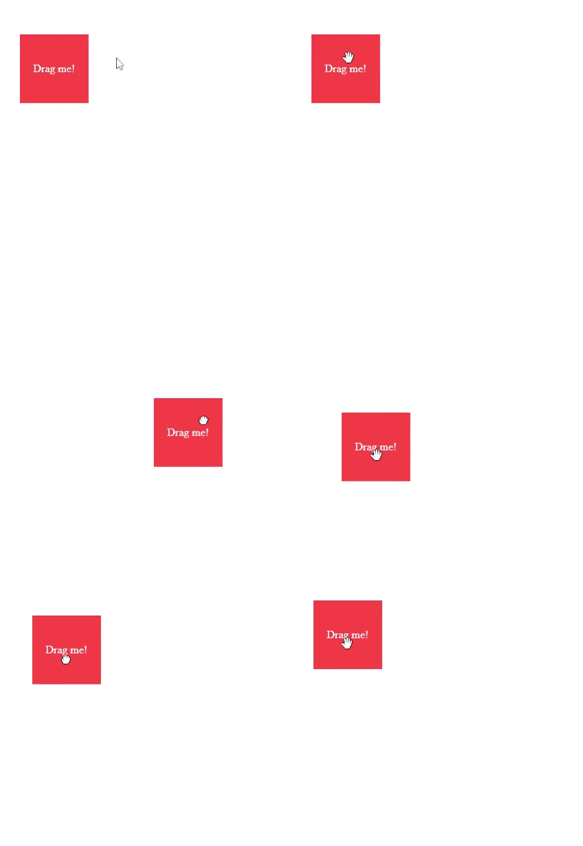
ii). Creating Stylish Draggable Elements with CSS Translate property
Output :

<!DOCTYPE html>
<html lang="en">
<head>
<meta charset="UTF-8">
<meta name="viewport" content="width=device-width, initial-scale=1.0">
<title>Draggable Element</title>
</head>
<body>
<div class="draggable" id="draggableElement">Drag me!</div>
</body>
</html>
.draggable {
        position: absolute;
        cursor: grab;
        width: 100px;
        height: 100px;
        background-color: #007bff;
        color: #fff;
        text-align: center;
        line-height: 100px;
    }

    .draggable.dragging {
        cursor: grabbing;
    }
Explaining the Styles
- Position: By using position: absolute;, we ensure that our draggable element may be moved freely throughout the webpage without affecting the layout of other elements.
- Cursor: The cursor: grab; attributes transforms the cursor into a grabbing hand icon when the user hovers over the draggable element, indicating that it can be dragged.
- Dimensions and Appearance: We define the width, height, background color, text color, alignment, and line height of the draggable element to make it visually appealing and easy to interact with.
- Drag State: When the element is dragged (dragging class applied), we change the cursor to a grabbing icon (cursor: grasping;) to give the user visual feedback.
let draggableElement = document.getElementById('draggableElement');
    let offsetX, offsetY;

    draggableElement.addEventListener('mousedown', startDragging);
    draggableElement.addEventListener('mouseup', stopDragging);

    function startDragging(e) {
        e.preventDefault();
        offsetX = e.clientX - draggableElement.getBoundingClientRect().left;
        offsetY = e.clientY - draggableElement.getBoundingClientRect().top;
        draggableElement.classList.add('dragging');
        document.addEventListener('mousemove', dragElement);
    }

    function dragElement(e) {
        e.preventDefault();
        let x = e.clientX - offsetX;
        let y = e.clientY - offsetY;
        draggableElement.style.left = x + 'px';
        draggableElement.style.top = y + 'px';
    }

    function stopDragging() {
        draggableElement.classList.remove('dragging');
        document.removeEventListener('mousemove', dragElement);
    }
How It Works:
- When a user clicks on a draggable element, the startDragging function is activated.
- Inside startDragging, we calculate the distance between the mouse pointer and the draggable element’s top-left corner.
- Add a CSS class (dragging) to indicate the element is being dragged..
- Add a global event listener (mousemove) to the document to trigger the dragElement method.
- DragElement continually updates its position based on mouse movement.
- When the user releases the mouse button (mouseup), the stopDragging function removes the dragging class and the mousemove event listener.
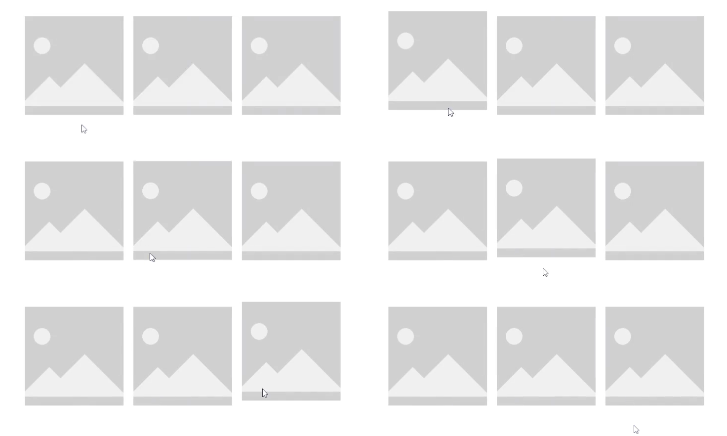
iii). Creating a Centered Image Gallery with Hover Effects CSS Translate property :
Output :

<!DOCTYPE html>
<html lang="en">
<head>
  <meta charset="UTF-8">
  <meta name="viewport" content="width=device-width, initial-scale=1.0">
  <title>Translate Hover Effect</title>
</head>
<body>
  <div class="image-container">
    <img src="image1.jpg" alt="Image 1" class="hover-image">
    <img src="image2.jpg" alt="Image 2" class="hover-image">
    <img src="image3.jpg" alt="Image 3" class="hover-image">
  </div>
</body>
</html>
body {
  display: flex;
  justify-content: center;
  align-items: center;
  height: 100vh;
  margin: 0;
}

.image-container {
  display: flex;
  gap: 20px;
  max-width: 1000px;
    flex-wrap:wrap;
}

.hover-image {
  width: 200px;
  height: 200px;
  object-fit: cover;
  transition: transform 0.3s ease-in-out;
}

.hover-image:hover {
  transform: translateY(-10px);
}
display: flex;: The display: flex; property is used to create a flexible container. This attribute makes it easy to create a flexible and responsive layout structure without requiring floats or positioning.
Benefits of display: flex; :
- Easy alignment options for horizontal and vertical items.
- Customize the visual order of things without affecting the HTML structure.
- Flexibility: Items can adjust to fit the available area, resulting in a responsive design.
- Efficiently arrange space within items along main axis (row or column).
flex-wrap: wrap;:
The flex-wrap: wrap; property, used in conjunction with display: flex;, controls how flex objects wrap across several lines.
Benefits of flex-wrap: wrap;
- Responsive Design: Allows objects to migrate to the next line when there is insufficient space on an one line, essential for responsive layouts.
- Better Utilization of Space: Allowing things to wrap improves space utilisation and prevents overflow issues.
- Consistency: It contributes to a uniform and organised layout regardless of screen size.
- max-width: 1000px;: Limits the container’s width to 1000 pixels to prevent it from expanding too far on large screens.
- justify-content: center;: Horizontally centers the content.
- height: 100vh;: Ensures that the body takes up the entire height of the viewport.
- transform: translateY(-10px);: Moves the image up by 10px when hovered, creating a lifting effect.
- object-fit: cover;: In CSS, the object-fit: cover; property specifies how an image or video will be scaled to fit its container. This feature is very useful for ensuring that media assets keep their aspect ratio while filling the full container, which is essential when developing visually appealing and responsive designs.
Benefits of object-fit: cover;
- The image or video maintains its original aspect ratio, preventing it from appearing stretched or squashed.
- The media element fills the container completely, leaving no gaps.
- Responsive design is essential for building layouts that adapt to various screen sizes and orientations.
- Improves Aesthetics: Consistently distributes content and highlights crucial portions for a polished and professional appearance.
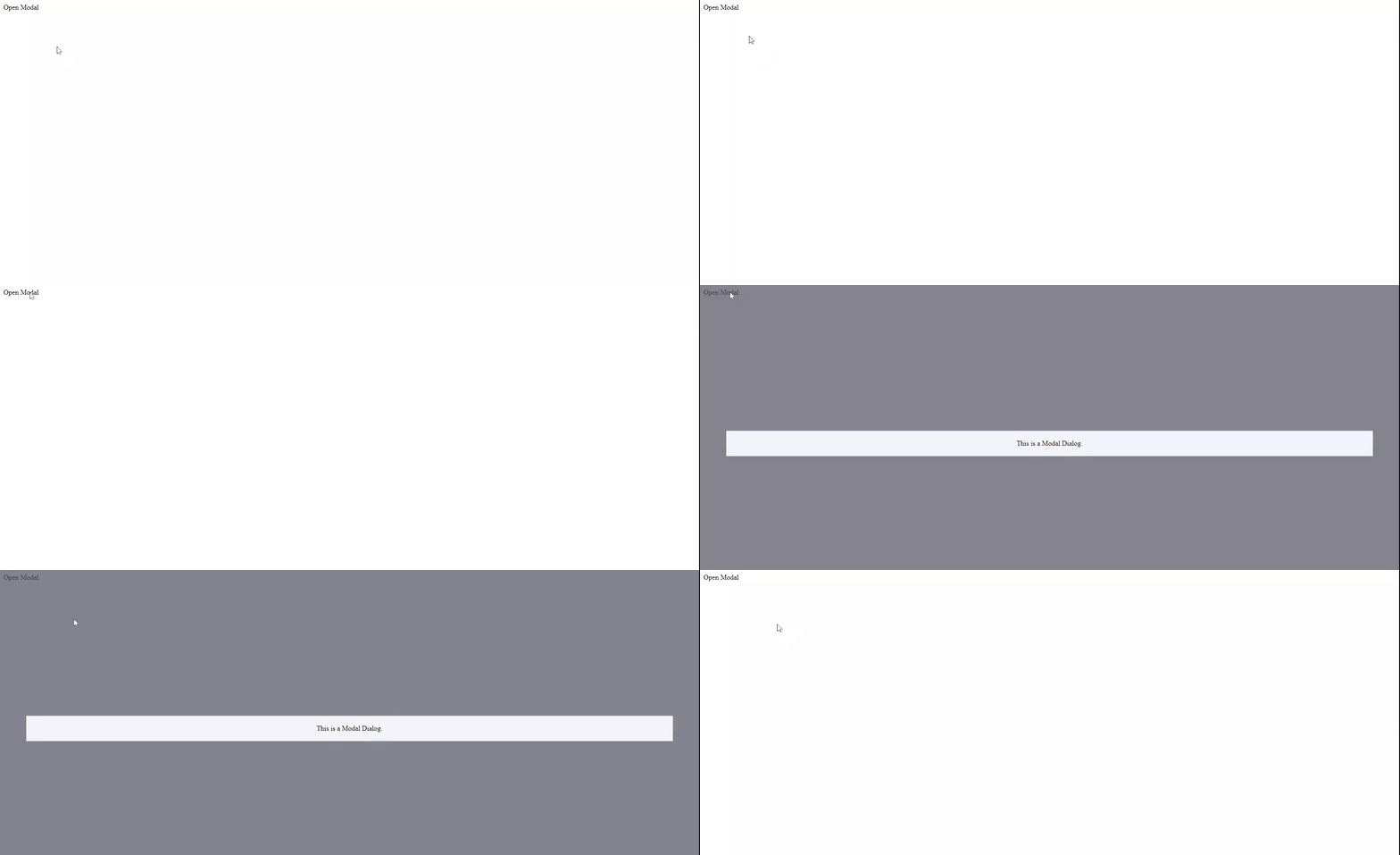
iv).Creating a Smooth and Responsive Modal using CSS Translate Property:
Modals are used in modern web development to display content overlays including dialogues, forms, and notifications. Creating a responsive and visually appealing modal can dramatically improve the user experience.
Output :

<!DOCTYPE html>
<html>
<head>
    <meta charset='utf-8'>
    <meta http-equiv='X-UA-Compatible' content='IE=edge'>
    <title>Page Title</title>
    <meta name='viewport' content='width=device-width, initial-scale=1'>
</head>
<body>
     <label for="checkbox">Open Modal</label>
 <input hidden type="checkbox" id="checkbox">
<label for="checkbox" class="modal-overlay">
  <label class="modal">
    This is a Modal Dialog.
</label>
</body>
</html>
How It Works
Initial State: The overlay and modal are hidden. The overlay is invisible and non-interactive, with an opacity of 0 and no pointer-events. The modal is slightly offset using transform: translate(-50%, -70%).
Activating the Modal: When the associated input (checkbox) is checked, the overlay is displayed (display: block; opacity: 1; pointer-events: auto). and the modal moves smoothly to the centre (transform: translate(-50%, -50%);).
.modal-overlay {
  position: fixed;
  top: 0;
  right: 0;
  bottom: 0;
  left: 0;
  background-color: rgba(77, 79, 94, 0.7);
  opacity: 0;
  pointer-events: none;
  transition: opacity 0.1s ease-in-out;
}
.modal {
  position: fixed;
  width: 90%;
  padding: 20px;
  top: 50%;
  left: 50%;
  text-align: center;
  transform: translate(-50%, -70%);
  background-color: rgb(242, 243, 247);
  transition: transform 0.3s ease-in-out;
}

input:checked ~ .modal-overlay {
  display: block;
  opacity: 1;
  pointer-events: auto;
}
input:checked ~ .modal-overlay .modal {
  transform: translate(-50%, -50%);
}
- The.modal-overlay class creates the semi-transparent backdrop that covers the entire viewport when the modal is active.
- position: fixed;: Keeps the overlay aligned with the viewport even while scrolling.
- Top, Right, Bottom, Left: 0;: These properties ensure the overlay covers the full viewport.
- opacity: 0;: Initially, the overlay is invisible.
- opacity: 1;: Sets the overlay to be completely opaque.
- transform: translate(-50%, -50%);: Centers the modal vertically in the viewport for a smooth pop-up effect.
- background-color: rgb(242, 243, 247);: Light background color for the modal content.
RBG Color Mode
The syntax for specifying colors in RGB mode in CSS is as follows:
rgb(red, green, blue)- Red, green, and blue are numbers ranging from 0 to 255 that represent the intensity of each color component.
- The rgb() function accepts three parameters, each of which specifies the intensity of the red, green, and blue components.
pointer-events: none;: Disables mouse and touch events when the overlay is invisible.
Here are the values that pointer-events can take and their effects:
- auto: The default value. The element responds to pointer events normally, based on the browser’s default behaviour and other CSS properties.
- none: The element does not respond to pointer events. Any mouse or touch interactions will pass through the element to the elements behind it. This is useful for creating overlays that don’t interfere with underlying elements.
- visiblePainted: This value causes the element to respond to pointer events only when the area of the element receiving the event is visible and painted (i.e., not transparent). It is commonly used in SVG content.
- visibleFill: The element only responds to pointer events that occur in the element’s fill area (for SVG elements).
- visibleStroke: The element only responds to pointer events that occur on its stroke area (for SVG elements).
- visible: The element responds to pointer events only when it is visible (i.e. not transparent). This adds the effects of visiblePainted, visibleFill, and visibleStroke.
- painted: The element responds to pointer events that occur on the painted part of the element, regardless of visibility.
- fill: The element responds to pointer events that occur on its fill area (for SVG elements), independent of visibility.
- stroke:The element responds to pointer events that occur on its stroke area (for SVG elements), independent of visibility.
- all: The element responds to all pointer events, including those that are not filled or visible.
- inherit: The element inherits the parent element’s pointer-events value.
v). Creating Expanding Search Bars using CSS Translate property:
A well-designed search bar improves functionality while also adding a sense of elegance to the interface. In this blog post, we will look at how to create dynamic search bars with CSS translate property.
Output :

<!DOCTYPE html>
<html>
<head>
    <meta charset='utf-8'>
    <meta http-equiv='X-UA-Compatible' content='IE=edge'>
    <title>Page Title</title>
    <meta name='viewport' content='width=device-width, initial-scale=1'>
</head>
<body>
    <div class="search-container">
        <input type="text" placeholder="Search...">
    </div>
</body>
</html>
.search-container {
            position: relative;
            width: 200px;
            transition: width 0.4s;
        }
            .search-container input {
            width: 100%;
            padding: 10px;
            border: 1px solid #ccc;
            border-radius: 25px;
            transition: width 0.4s;
        }
        .search-container:focus-within {
            width: 400px;
        }
        input:focus-visible
        {
            outline:2px solid #ee3646  ;
        }
- .search-container: The search-container class defines the container for our search bar. It sets the initial width to 200 pixels and specifies a transition effect for width changes lasting 0.4 seconds.
- .search-container input: This refers to the input element within the search container. It initially spans the entire width of its container, inheriting the transition effect as the width changes. Padding, border, and border-radius are additional style options for the input field.
- .search-container:focus-within: This pseudo-class is used when any descendent of.search-container takes focus. When the input field is focused, the width extends to 400 pixels, with the defined transition property ensuring a seamless transition.
- input:focus-visible: This selector selects the input element when it receives focus and is visible to the user. It creates a visible edge for the input field, providing clear visual feedback when the user interacts with it.
vi).Creating dynamic Search Bars using CSS Translate property:
Forms are essential for user engagement on the web. Forms serve as the gateway to involvement, whether it’s logging into a favourite website, signing up for a subscription, or completing a purchase.However, creating forms that are both functional and aesthetically beautiful can be difficult. This is where CSS classes like.form-group come in handy, providing an organised approach to form design.
Output :

<!DOCTYPE html>
<html>
<head>
    <meta charset='utf-8'>
    <meta http-equiv='X-UA-Compatible' content='IE=edge'>
    <title>Page Title</title>
    <meta name='viewport' content='width=device-width, initial-scale=1'>
</head>
<body>
    <div class="form-group">
        <input type="text" placeholder=" " id="name" required>
        <label for="name">Your Name</label>
    </div>
</body>
</html>
.form-group {
            position: relative;
            margin-bottom: 15px;
            max-width: 900px;
            margin-top: 50px;
        }
            .form-group input {
            width: 100%;
            padding: 10px;
            font-size: 16px;
            border: 1px solid #ccc;
            border-radius: 5px;
            outline: none;
            border-radius: 20px;
        }
        .form-group label {
            position: absolute;
            top: 10px;
            left: 10px;
            font-size: 17px;
            color: #999;
            pointer-events: none;
            transition: all 0.3s;
        }
        .form-group input:focus + label,
        .form-group input:not(:placeholder-shown) + label {
            top: -20px;
            left: 10px;
            font-size: 16px;
            color: #ee3646;
            transform: translateY(-10px);
        }
- The.form-group class serves as the basis for our enchantment. It creates a structural layout for our form elements, ensuring they are well-organized and visually consistent. Our form groups are elegantly positioned and styled using properties such as position: relative, margin, and max-width.
- The.form-group input and.form-group label selectors are where the magic happens. These selectors apply certain styles to our input fields and labels, making them into interactive elements.
- Input fields in the.form-group inherit styles that stretch to the entire width of the container, with padding for comfort and a slight border to establish limits. The outline: none declaration maintains a clean design, while border-radius adds beauty with rounded edges.
Conclusion
In the ever-changing world of web development, learning CSS properties like as translate is critical for developing engaging and flexible user experiences. Whether used to create subtle animations, optimise speed, or improve usability, the translate property allows developers to bring their design ambitions to life with grace and subtlety. So, embrace the power of translation and open up a world of creative possibilities for your web projects.
