Table of Contents
Understanding the CSS Rotate Property:
The rotate property is part of the CSS transform module, which allows developers to apply different transformations to elements on a webpage. The rotate function allows you to rotate items by a specified angle, changing their orientation but not their location in the document flow. This characteristic provides tremendous versatility by permitting rotations in both clockwise and anticlockwise orientations.
Syntax and Usage:
The CSS rotate property’s syntax is rather easy. Developers define the desired rotation angle within the brackets of the rotate function, as follows:
.rotate {
    transform: rotate(45deg);
}
In this example, the.rotate class rotates the target element 45 degrees clockwise. It is important to note that angles can be written in a variety of units, including degrees (deg), radians (rad), and gradians (grad), giving developers the freedom to select the most appropriate unit for their needs.
1. Rotating Element using CSS Transform property :
Output:

<!DOCTYPE html>
<html lang="en">
<head>
<meta charset="UTF-8">
<meta name="viewport" content="width=device-width, initial-scale=1.0">
<title>Rotation Example</title>
<style>
.rotate {
    width: 100px;
    height: 100px;
    background-color: #ff5733;
    transition: transform 0.5s ease; /* Smooth transition */
}

.rotate:hover {
    transform: rotate(180deg); /* Rotates 180 degrees on hover */
}
</style>
</head>
<body>
<div class="rotate"></div>
</body>
</html>
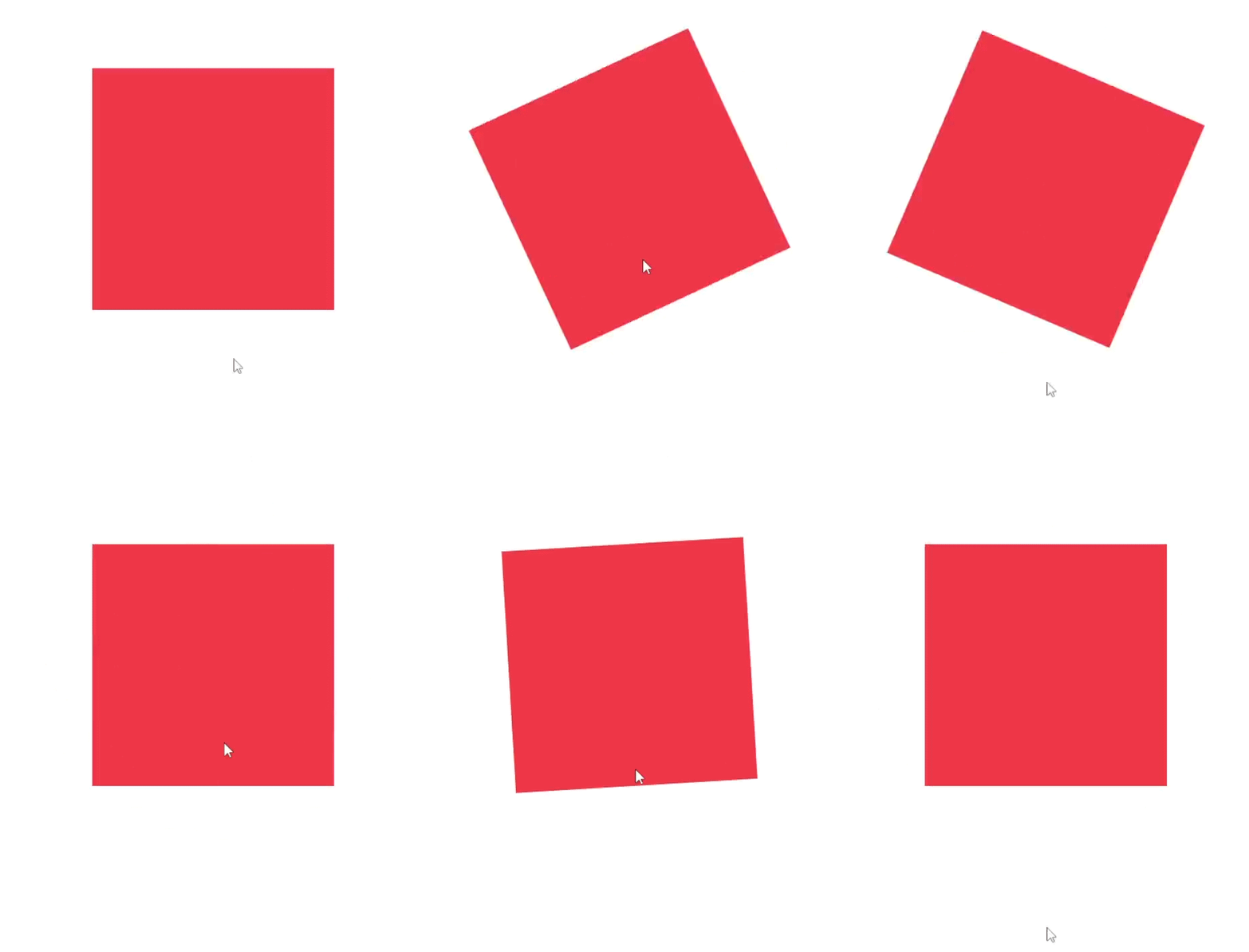
In this example, when you hover over the element with the class “rotate,” the transition attribute causes it to rotate 180 degrees smoothly over 0.5 seconds.
Lets see complex example of css Rotate property:
2. Spinning wheel using CSS Transform property:
Output:

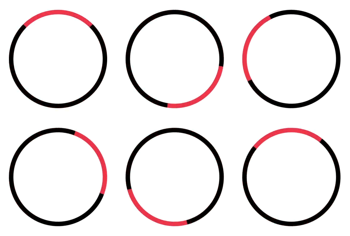
Spinning animations may grab attention and offer the feel of fun to your website. In this blog post, we’ll go through how to make a simple spinning wheel with HTML and CSS.
<!DOCTYPE html>
<html lang="en">
<head>
<meta charset="UTF-8">
<meta name="viewport" content="width=device-width, initial-scale=1.0">
<title>Spinning Wheel</title>
<style>
  .wheel {
    width: 200px;
    height: 200px;
    border: 10px solid black;
    border-top: 10px solid red;
    border-radius: 50%;
    animation: spinWheel 2s linear infinite;
  }

  @keyframes spinWheel {
    0% {
      transform: rotate(0deg);
    }
    100% {
      transform: rotate(360deg);
    }
  }
</style>
</head>
<body>
  <div class="wheel"></div>
</body>
</html>
Next, let’s dive into the CSS. Here’s what each part of the CSS does:
- border-radius: 50%; makes the div a perfect circle by rounding its corners.
- @keyframes spinWheel: This defines a keyframe animation called “spinWheel”. Keyframe animations allow us to progressively update an element’s CSS properties over a set duration.
- 0%: At the beginning of the animation, the wheel is rotated 0 degrees.
- 100%: At the end of the animation, the wheel is rotated 360 degrees, completing one full rotation.
- animation: This property applies the “spinWheel” animation to our wheel element. We set it to run for 2 seconds with a linear timing function, and we specify that it should repeat infinitely.
3. Clockwise and Anti-clockwise Rotation using CSS Transform property
Output:

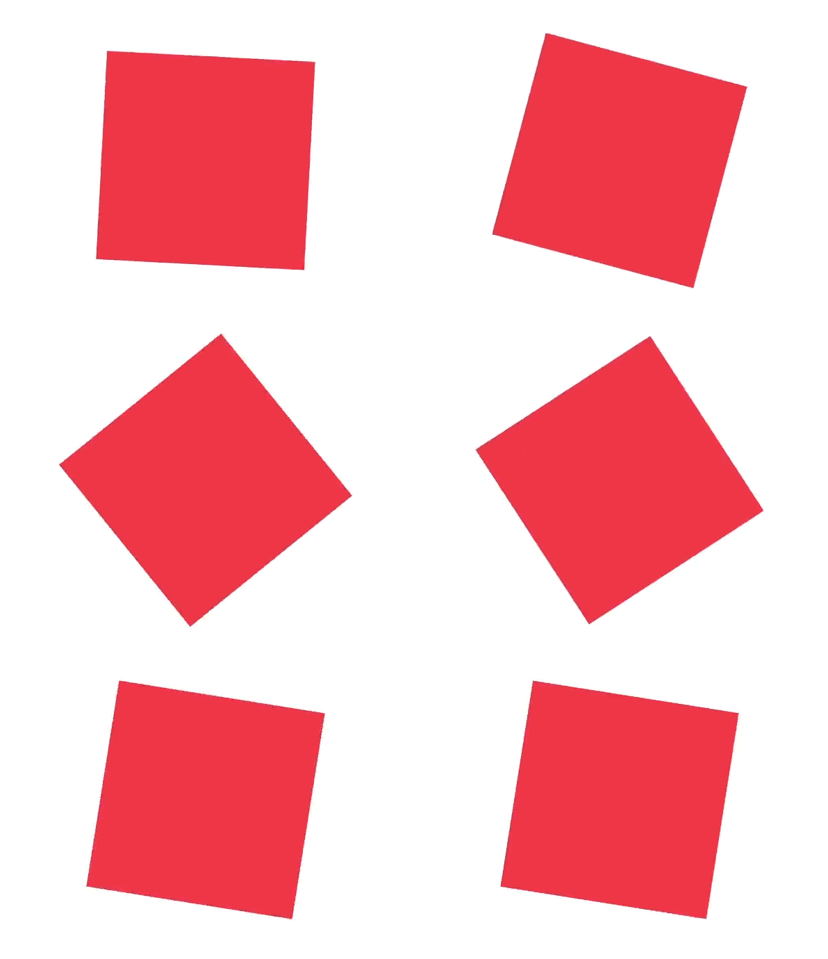
Have you ever wondered how to make animations on a website with simply HTML and CSS? CSS animations allow you to bring your site elements to life by moving, rotating, and transitioning them in exciting ways. In this example, we’ll look at a basic yet efficient way to create clockwise and anti-clockwise rotating animations with CSS.
<!DOCTYPE html>
<html lang="en">
<head>
<meta charset="UTF-8">
<meta name="viewport" content="width=device-width, initial-scale=1.0">
<title>Clockwise and Anti-clockwise Rotation</title>
<style>
  .element {
    width: 100px;
    height: 100px;
    background-color: green;
    animation: rotateClockwise 2s linear infinite alternate;
  }

  @keyframes rotateClockwise {
    0% {
      transform: rotate(0deg);
    }
    100% {
      transform: rotate(360deg);
    }
  }
</style>
</head>
<body>
  <div class="element"></div>
</body>
</html>
4. Creates a visually appealing analog clock with hour, minute, and second hands using CSS Transform property
HTML:
<!DOCTYPE html>
<html>
<head>
    <meta charset='utf-8'>
    <meta http-equiv='X-UA-Compatible' content='IE=edge'>
    <title>Page Title</title>
    <meta name='viewport' content='width=device-width, initial-scale=1'>
    <link rel='stylesheet' type='text/css' media='screen' href='main.css'>
 </head>
<body>
    <article class="clock">
        <div class="hours-main">
          <div class="hours"></div>
        </div>
        <div class="minutes-main">
          <div class="minutes"></div>
        </div>
        <div class="seconds-main">
          <div class="seconds"></div>
        </div>
      </article>
</body>
</html>
CSS:
.clock {
  border-radius: 50%;
  background: #fff url(clock.svg) no-repeat center;
  background-size: 88%;
  /*height: 20em;*/
  padding-bottom: 20%;
  position: relative;
  width: 20em;
}
.clock.simple:after {
  background: #000;
  border-radius: 50%;
  content: "";
  position: absolute;
  left: 50%;
  top: 50%;
  transform: translate(-50%, -50%);
  width: 5%;
  height: 5%;
  z-index: 10;
}
.minutes-main, .hours-main, .seconds-main {
  position: absolute;
  top: 0;
  right: 0;
  bottom: 0;
  left: 0;
}
.hours {
  background: #000;
  height: 20%;
  left: 48.75%;
  position: absolute;
  top: 30%;
  transform-origin: 50% 100%;
  width: 2.5%;
}
.minutes {
  background: #000;
  height: 40%;
  left: 49%;
  position: absolute;
  top: 10%;
  transform-origin: 50% 100%;
  width: 2%;
}
.seconds {
  background: #f80c0c;
  height: 45%;
  left: 49.5%;
  position: absolute;
  top: 14%;
  transform-origin: 50% 80%;
  width: 1%;
  z-index: 8;
}
@keyframes rotate {
  100% {
    transform: rotateZ(360deg);
  }
}
.hours-main {
  animation: rotate 43200s infinite linear;
}
.minutes-main {
  animation: rotate 3600s infinite linear;
}
.seconds-main {
  animation: rotate 60s infinite linear;
}
This CSS code defines the styling for a clock interface using HTML and CSS. Let me break down what each part does:
- .clock: This class styles the clock’s outer container. It creates a circular shape with border-radius: 50%, adds a background picture of a clock face, specifies the size and position of the clock, and secures the clock’s aspect ratio by using padding-bottom as a percentage of its width.
- .clock.simple:after: This pseudo-element :after is used to create the clock’s center point. It positions a small black dot at the center of the clock face.
- .minutes-main, .hours-main, .seconds-main: These classes position the hour, minute, and second hands respectively. They set each hand’s position to absolute within the clock container, stretching them to cover the entire clock face.
- .hours, .minutes, .seconds: These classes style the hour, minute, and second hands respectively. They set their colors, heights, widths, and positions within the clock face. They also define the transform-origin, which is the point around which the elements will rotate.
- @keyframes rotate: This defines an animation keyframe called rotate that rotates the clock hands 360 degrees, completing a full rotation. This animation is used to animate the rotation of the clock hands.
- .hours-main, .minutes-main, .seconds-main: These classes use the rotate animation for the hour, minute, and second hands, respectively. Each hand is animated at a distinct speed to appropriately represent the passage of time. For example, the hour hand rotates once every 12 hours (43200 seconds), the minute hand once every hour (3600 seconds), and the second hand once every minute (60 seconds). The infinite keyword causes the animation to continue indefinitely, whereas linear specifies a linear timing function for smooth rotation.
5. Animated flip card using using CSS Transform property
HTML:
Output:

<!DOCTYPE html>
<html lang="en">
<head>
<meta charset="UTF-8">
<meta name="viewport" content="width=device-width, initial-scale=1.0">
<title>Animated Flip Card</title>
</head>
<body>
<div class="card-container">
    <div class="card" id="card" onclick="togglebuton();">
        <div class="front" style="background-color: #ee3646; color: #fff;">
            <h2>Front</h2>
        </div>
        <div class="back" style="background-color: #353535; color: #fff;">
            <h2>Back</h2>
        </div>
    </div>
</div></body>
</html>
CSS:
.card-container {
        perspective: 1000px;
    }
    .card {
        width: 200px;
        height: 200px;
        position: relative;
        transform-style: preserve-3d;
        transition: transform 0.6s;
    }
    .card.flip {
        transform: rotateY(180deg);
    }
    .card .front,
    .card .back {
        width: 100%;
        height: 100%;
        position: absolute;
        backface-visibility: hidden;
    }
    .card .back {
        transform: rotateY(180deg) translateZ(1px);
    }
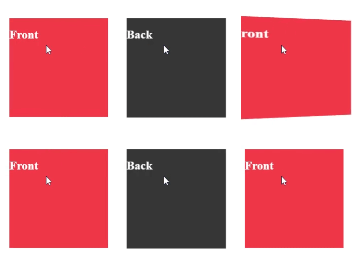
This code creates a simple CSS-based card flip animation. Let’s take it step by step:
- .card-container: This class is assigned to the container element that contains the cards. The perspective attribute specifies the depth of the 3D space in which the cards are rendered. A greater value produces more noticeable 3D effects.
- .card: This class corresponds to each individual card. Its width and height are fixed at 200 pixels, and its position is set to relative. The transform-style: preserve-3d feature ensures that the card’s child elements maintain their 3D positioning when transformed.
- .card.flip: This class is added to a card when it is required to be flipped. It performs the transformation using rotateY(180deg), which rotates the card 180 degrees around the Y-axis, effectively flipping it over. The transform attribute provides the transition’s duration (0.6 seconds) and ease.
- .card .front, .card .back: These classes represent the card’s front and back faces, respectively. They are perfectly positioned within the card element, occupying its complete width and height. The backface-visibility: hidden feature ensures that the back face is not visible when the card is facing forward.
- .card .back: This seminar focuses solely on the card’s back face. It is initially rotated 180 degrees along the Y-axis and translated by one pixel along the Z-axis. This translation is required to avoid potential flickering or z-fighting issues caused by the back face being exactly behind the front face.
Javascript:
function togglebuton(){
    document.getElementById("card").classList.toggle('flip');
}
document.getElementById – to select the HTML element with the ID card. The document object represents the webpage, and getElementById is a method that retrieves an element by its ID attribute.
.classList.toggle(‘flip’); :- This part uses the classList property of the selected element, which provides methods to manipulate the classes of the element. The toggle method is called with the argument ‘flip’. This method adds the class ‘flip’ to the element if it is not already present, and removes it if it is present.
6. Rotating animation effect on hover using CSS Transform Property:
HTML:
<!DOCTYPE html>
<html>
<head>
    <meta charset='utf-8'>
    <meta http-equiv='X-UA-Compatible' content='IE=edge'>
    <title>Page Title</title>
    <meta name='viewport' content='width=device-width, initial-scale=1'>
</head>
<body>
    <div class="carousel">
         <img src="image1.jpg" alt="Image 1">
        <img src="image2.jpg" alt="Image 2">
        <img src="image3.jpg" alt="Image 3">
      </div>
      </body>
</html>
CSS:
.carousel {
      display: flex;
      overflow: hidden;
    }
    .carousel img {
      width: 100px;
      height: 100px;
      transition: transform 0.5s ease;
    }
    .carousel img:hover {
      transform: rotate(360deg);
}- display: flex;: This makes the container a Flexbox container. Flexbox is a layout model that allows items within the container to be aligned and distributed efficiently.
- overflow: hidden;: This hides any content that overflows outside the boundaries of the container. This is useful for carousels where images might be partially or fully outside the visible area of the container.
- transition: transform 0.5s ease;: Adds a transition effect for the transform property. The effect will last 0.5 seconds and will have an easing function for a smoother animation.
- .carousel img:hover: This targets the images when they are hovered over with the mouse.
- transform: rotate(360deg);: Applies a rotation transformation, rotating the image 360 degrees when hovered.
Summary:
- Flexbox Layout: The carousel uses Flexbox for arranging the images in a row.
- Overflow Handling: The container hides any content that exceeds its dimensions.
- Fixed Image Size: Images are set to a fixed size of 100×100 pixels.
- Smooth Animation: A smooth rotation animation is applied to each image when hovered over, rotating it fully (360 degrees) over 0.5 seconds.
Conclusion
The CSS rotate feature is a versatile and effective tool for applying rotation effects to web items. Understanding how to use this attribute effectively, whether you’re generating simple rotations or complicated animations, may improve the visual attractiveness and interaction of your online applications significantly. Experiment with different angles, transitions, and combinations to unlock the full power of the rotate feature in your designs.
