Table of Contents
Typography is an art form that breathes life into written communication. It’s important to consider how the words are presented in addition to the words themselves.One of the most critical elements of typography is the choice of font face.Fonts have the ability to express personality, tone, and mood, which can change how the reader reads the text. We’ll explore many font types and their unique characteristics as we get into the interesting the world of font faces in this blog post.
Typography – Serif Fonts: Adding Elegance and Tradition
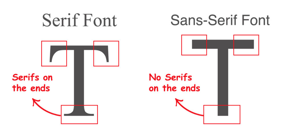
Serif fonts are characterized by small decorative flourishes, or “serifs,” at the ends of letter strokes. Many people identify these fonts with beauty, professionalism, and heritage. Known for their traditional appeal and readability, they are frequently found in print media including books, magazines, and newspapers.
Popular serif typefaces include Georgia, Garamond, and Times New Roman. A classic option for academic and professional writing, Times New Roman boasts balanced proportions and clear lines. Georgia, designed for digital readability, offers a modern twist on the traditional serif style. For book typography, Garamond is preferred due to its delicate serifs and good legibility.
Sans-Serif Fonts: Clean and Contemporary
Sans-serif fonts, as the name suggests, lack the decorative serifs of their serif counterparts. These fonts are celebrated for their clean, modern appearance and readability, particularly in digital formats. Sans-serif typefaces can be used for a variety of purposes, such as branding and web design.
Helvetica, Arial, and Calibri are among the most popular sans-serif fonts. Widely employed in corporate branding, user interfaces, and signage, Helvetica is known for its neutrality and adaptability. Because of its simple, clean appearance, Arial—a typeface similar to Helvetica—is a go-to option for digital communication. Since its release with Microsoft Office, Calibri has grown in popularity thanks to its great on-screen readability and elegant, modern appearance.

Script Fonts: Infusing Personality and Elegance
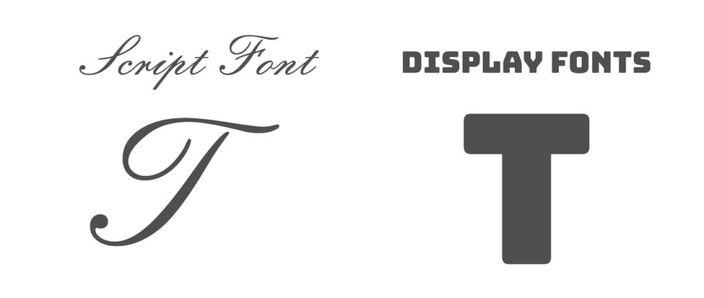
Script typefaces are handwriting-like and give text a whimsical, elegant, and charming touch. The cursive strokes in these typefaces are flowing and come in different styles and thicknesses. Script fonts are often used for invitations, greeting cards, and branding materials to evoke a sense of warmth and individuality.
Examples of script fonts include Brush Script, Great Vibes, and Lobster. Brush Script, with its casual, hand-painted appearance, lends a relaxed and approachable feel to designs. Great Vibes is ideal for feminine branding and wedding invites because of its elegant loops and flourishes, which radiate refinement and charm. lobster, Known for its strong, dynamic strokes, gives classic script font a contemporary touch that makes it perfect for attention-grabbing headlines and logos.
Display Fonts: Making a Bold Statement
Display fonts are designed to capture attention and make a statement. These fonts come in a wide range of styles, from bold and quirky to elegant and ornate, making them ideal for headlines, posters, and branding projects where impact is paramount.
Examples of display fonts include Impact, Cooper Black, and Bodoni Poster. Impact, with its heavy strokes and condensed letterforms, commands attention and is commonly used for headlines and signage. Cooper Black, characterized by its rounded serifs and friendly demeanor, has been a favorite for retro-inspired designs and advertising campaigns.

Monospaced Fonts: Ensuring Clarity and Consistency
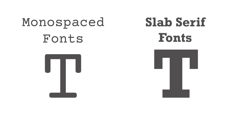
Monospaced fonts, also known as fixed-width or non-proportional fonts, allocate the same amount of horizontal space to each character, resulting in a uniform appearance. These fonts are valued for their clarity, consistency, and suitability for tasks that require precise alignment, such as coding and tabular data.
Examples of monospaced fonts include Courier, Consolas, and Monaco. Courier, originally designed for typewriters, is favored by programmers for its simplicity and legibility in code editors. Consolas is a common option for coding environments because of its distinct letters and well-defined letterforms, which are specifically optimised for on-screen reading. Mac users like Monaco because of its clean, sharp appearance and legible letter size, especially at smaller font sizes.
Slab Serif Fonts: Striking a Balance Between Tradition and Modernity
Slab serif fonts, also known as “Egyptian” or “block” fonts, feature thick, block-like serifs that are often uniform in width. These fonts strike a balance between the classic elegance of serif fonts and the boldness of sans-serif fonts, making them versatile for a variety of design applications.
Examples of slab serif fonts include Rockwell, Serifa, and Clarendon. Rockwell is a popular choice for headlines and branding because of its bold, geometric letterforms and prominent serifs that communicate a sense of firmness and authority. Serifa, designed for newspaper headlines, exhibits a straightforward, no-nonsense aesthetic with its sturdy serifs and balanced proportions. Clarendon, a timeless classic, combines traditional serif elements with modern, slab-like serifs, resulting in a versatile typeface suitable for both print and digital design.
Slab serif fonts are often used in contexts where a strong visual impact is desired, such as advertising, signage, and editorial design. Their bold appearance and high legibility make them well-suited for headlines, subheadings, and other prominent text elements. Slab serif fonts are a unique way to give your designs personality and focus, whether you’re going for a modern edge or a vintage-inspired aesthetic.

Conclusion
Font choice plays a pivotal role in shaping the visual identity and readability of text. There is a font face to fit every project and goal, whether you’re going for classic elegance, modern flair, or whimsical appeal. By understanding the characteristics of different font categories, you can effectively convey your message and captivate your audience through the art of typography. The next time you create written content or go on a design project, keep in mind the impact that font faces can have on readers.
